

Mega menus, mega-navigation pull-downs, super pull-downs (whatever you want to call them) are popping up everywhere! We've been using them for the past few years at Habanero, and I've noticed that there are a few simple tips that help with usability.
What is a mega-navigation menu?
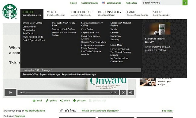
In case you haven't heard of these, mega-navigation menus usually drop down from the global navigation upon hover or click and display navigation options grouped together. They range in size, but to me, these menus are "mega" when they are grouped in two or more columns. For example, check out this five column example from Starbucks:
The benefits of doing something like this are:
- Task efficiency when implemented well — Users can jump to a section without going through intermediate pages and in theory, they can accomplish their task quicker. However, this is dependent on having clear, intuitive choices and a menu that performs well without too much or too little delay.
- Promote content— Content owners can promote content in a menu which is then visible from anywhere (for example the product promotion on the Starbucks site.)
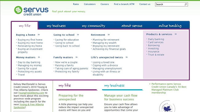
- Better decision making— Users get a quick sneak-peek of a particular section and can decide which section has the information they need. This is particularly helpful when a global navigation system is innovative or different, and the hover helps guide the user into the area they may be looking for. For example on the Servus Credit Union website, the global navigation is structured by life stages, but this might not be intuitive to all users. The mega-navigation menu gives the option to see all the life stages, but also to navigate content by the more traditional products and services approach.
We've developed mega-navigation menus for both public-facing sites and intranets, and here are a few tips we recommend when implementing:
Keep the landing page
We had a debate internally if it's redundant to have a landing / index page that people go to when they click on the main navigation option. If all the options are in the pull-down, why do we need the page?
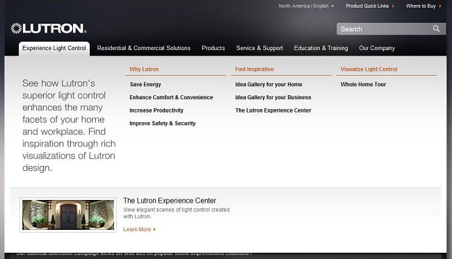
For example on the Lutron site, clicking a navigation option displays the mega-navigation menu and doesn't take you to another page:
In recent usability testing on two different sites, we found that some users expect to click on the option and find more information. They might be going to the landing page to get more context on the topic, or help them make a decision. This is especially true when a user is new to a site. Landing pages also have other benefits such as:
- Featuring the top tasks — Landing pages are often used to display top user tasks, calls to action, or common questions users may have.
- Giving context — Landing pages help guide users through an area, and give users context about what an area is about.
- Increasing search effectiveness — Landing pages and their associated URLs can help SEO and site search. They are also useful when a user enters a site from an external search engine and not necessarily through the homepage.
Have good contrast
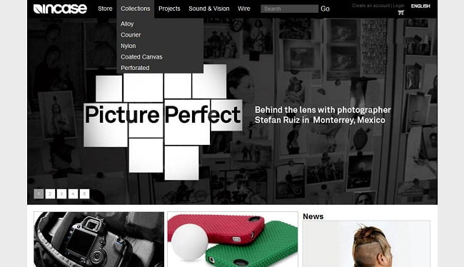
It's a good idea to make the menu as obvious as possible, and let people know what area is selected. The colour of the menu, and the menu highlight should stand out with good contrast. Take a look at this example from Incase where one of the images in their carousel doesn't work too well with the navigation menu:
Adding a border to the menu, changing the shades of the menu or avoiding dark images, could make the menu more visible.
Test the timing and interaction
We try to prototype a mega-navigation menu for usability testing as early as possible in the design phase. At this point we work on what the appropriate delay is, if the menu is too big or small, if it's awkward to get to certain sections, etc.
For example, it's a best practice to delay opening the hover because you don't want it flashing open every time a user moves their mouse over the navigation menu. Some sites also delay closing (look at target.com as an example) which helps when many options are packed together and a user might move their mouse slightly by accident.
We also test whether the options are intuitive, if people can click on them (don't make the click targets too small!) and if the size of the hover changes too much between options.
If you're looking for more example and inspiration, I recommend checking out a couple of detailed articles on the subject:
Smashing Magazine:
www.smashingmagazine.com/2009/03/24/designing-drop-down-menus-examples-and-best-practices/
Jakob Nielsen's Alertbox:
www.useit.com/alertbox/mega-menus-wrong.html
UX Movement:
www.uxmovement.com/navigation/why-hover-menus-do-users-more-harm-than-good

.jpeg?bc=white&la=en&mw=750&modified=20240425205732&hash=3BEA466CAE728881BC34AFB352436B3E2A037150)

