

Nintex Forms also provides the ability to add optimized layouts for a selection of smartphones and tablets. You can also add your own devices (by user agent string) if Nintex’s default set of device layouts don’t serve all of your needs. You can read more about the product here.
The out-of-the-box (OOTB) Nintex Forms template has support for desktop, smartphones, Windows Phone 7, iPhone, Android, iPad, and Blackberry device layouts and comes with distinctive Nintex-branded styling. Of course, not every company will want to use Nintex’s logo and the Nintex company colors for their forms. Here’s how you can create a custom branded template to use as a starting point for all of your company’s SharePoint forms.
Creating our test library
The easiest way to get up and running quickly is to create a testing document library where we’re going to apply our template, I’m going to name it “Expenses”.
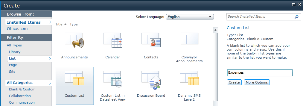
Figure 1 - Creation of a new list
Next, I’m going to add some columns.
We should be at our newly created list. In the ribbon there should be a tab section called List Tools and a tab called List. In the List tab there should be a List Settings button.
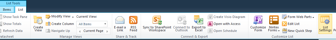
Figure 2 – Customizing a new list
After we click on the list settings button, navigate down on the page to the Columns section and click on the Create Columns link). We’re going to add the following columns to our Expenses list.
- A column named Description of type Multiple lines of text
- A column named Date of Expense of type Date and Time
- A column named Amount of type of type Currency
We now have a list that has a variety of input fields for our form.
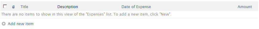
Figure 3 – Newly created list
When we click on the “Add new item” link, we’ll see the familiar OOTB edit form as shown below:
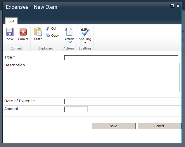
Figure 4 – Default SharePoint input form for Expenses list
Customize the form using Nintex Forms
In order to customize this form using Nintex, we’ll need to navigate to the “Nintex Forms” item in the “List Settings” section of the ribbon for the list and click on “Customize the Item Form” in the drop-down menu.
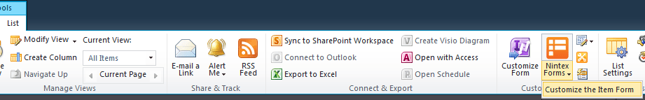
Figure 5 – Customize the list with Nintex Forms
This will launch the Nintex Forms interface which loads the default Nintex Forms style.
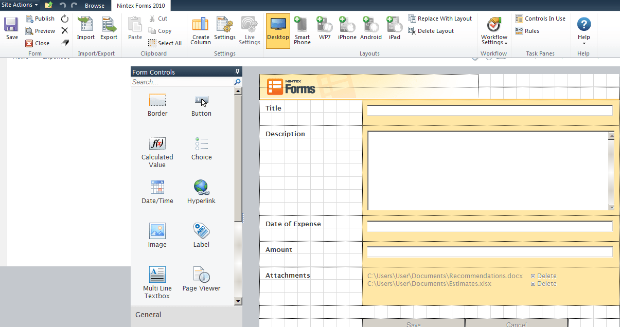
Figure 6 – Nintex Forms editor
For this example today, we’re going to add in our own logo, style the header, and add some customized CSS in order to style the rest of the form.
There are two objects in the default styling that comprise the header of the form: the Nintex Forms logo and a border control. These elements can be safely removed (or in this case, changed) and replaced with our own controls.
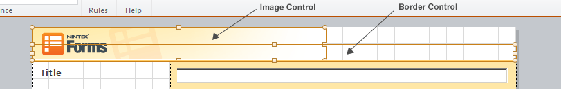
Figure 7 – Default Nintex Forms header controls
For this example, I’m going to replace the Nintex Forms logo with the Habanero one and I’m going to change the border element’s height and color to match our brand.
First delete the previous image control, and then drag a new image onto the form.
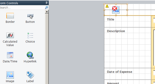
Figure 8 – Newly added image and border controls
Next, fill out the appropriate control properties to load your new image. The image should be deployed as part of your solution so that it’s always available to any location where a Nintex Form could be used. The width and height can be filled out here (the default value is 100% for both), but for this example I’m going to clear out those values and set the dimensions via custom CSS. I have given it a class of “hcf-logo” for this purpose.
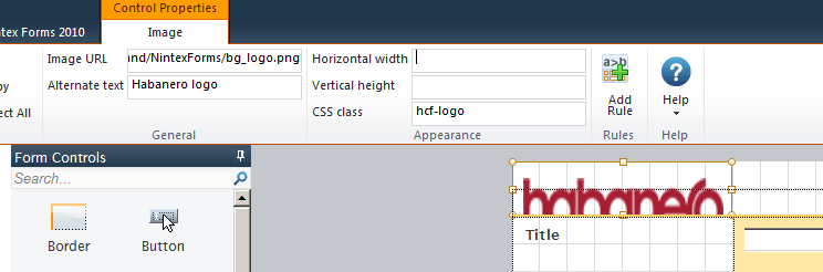
Figure 9 – Customizing image control properties
Now let’s specify the height and width of the image and add some margins to make it look a little better in CSS.
In order to customize the CSS for the form, you need to access the settings for the form itself. This is a link on the ribbon in the “Nintex Forms 2010” section called “Settings”.
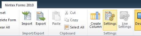
Figure 10 – Nintex Forms settings link
In the “Settings” modal there is a section called “Custom CSS” where we can add our own custom overrides and rules for any styling we wish to achieve.
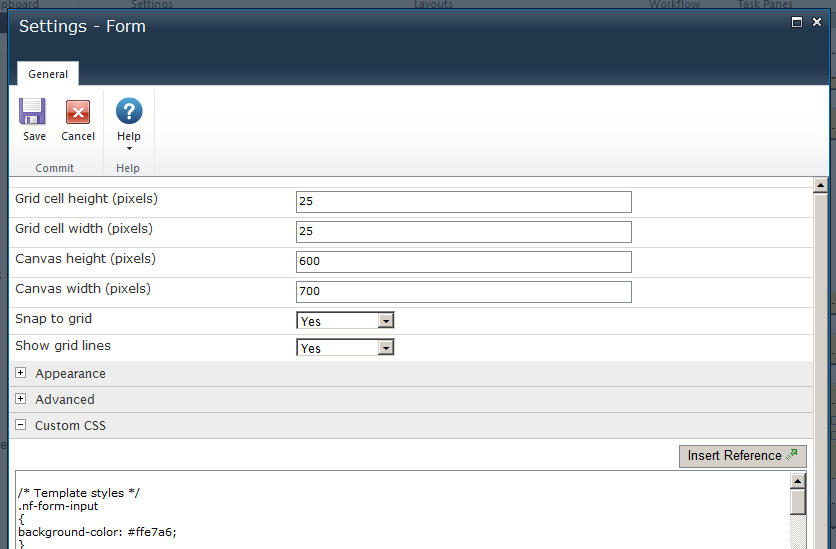
Figure 11 – Nintex Form settings modal
I usually keep the current styles intact to embrace the cascade and add a new section at the bottom of the section with my custom styling.
We’re going to add a section header and one rule for our recently added logo.
img.hcf-logo {
	height: 25px;
	margin: 15px 10px;
	width: 135px;
}
Next we’re going to customize the border. There aren’t many options in the ribbon for customizing the border control other than adding a class (which I added as “hcf-topBorder” just in case).
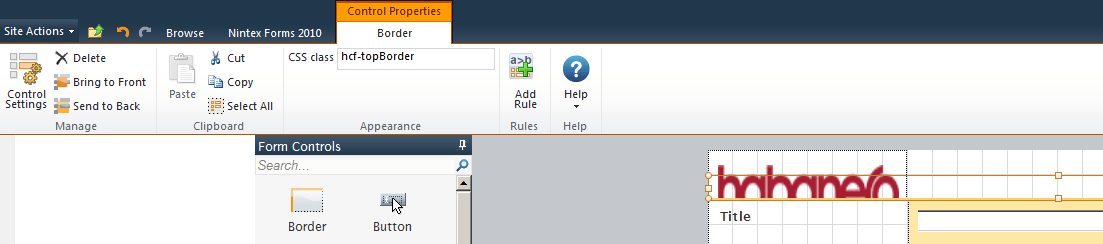
Figure 12 – Nintex Forms border control properties
In order to access the control settings for the border control you need to click on the “Control Settings” button on the right-hand side of the ribbon. For this example, I’m going to set the height of the current border control to be 1px and change the color to be our Habanero red within the control itself. I would normally do this within CSS, but the options specified in the control settings are applied as inline styles when the control is rendered in the modal, so to avoid the need to override the inline styles using !important declarations, I’m going to make the changes in the “Control Settings” modal.
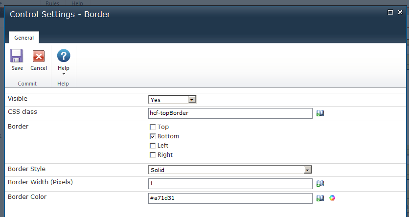
Figure 13 – Nintex Forms border control settings modal
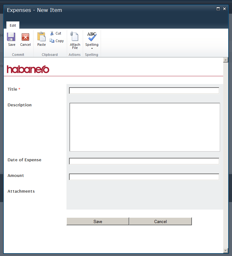
Now that the header changes have been made, let’s have a look at how this looks within the form itself.
In order to view what the customized form looks like, we need to publish the form (an option from the “Nintex Forms 2010” section on the ribbon), close the Nintex Forms editor, then either add a new item to the list or edit an item currently in the list. Clicking on “Add new item” will show us what the form looks like right now.
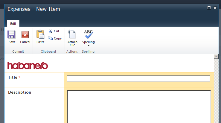
Figure 14 – Customized Nintex Form so far
We’re getting closer! The border element is output, but is too close to the first input row of the form. My first inclination would be to add some CSS targeting the border element and adding some margin, but unfortunately due to the way Nintex Forms outputs each of the controls (absolutely positioned DIVs), any added margin to a border control will not be respected. To meet this purpose I’m going to move all of the fields down one block and add an empty “Rich Text” control as a placeholder to keep the space. Moving the fields down one block will work for this form, but for the template we’re creating, using an actual control is more ideal to save us work later.
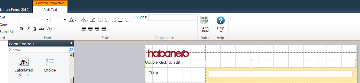
Figure 15 – Customized Nintex Form with added rich text control as a spacer
After publishing the form and adding a new item, we get our desired effect in the form:
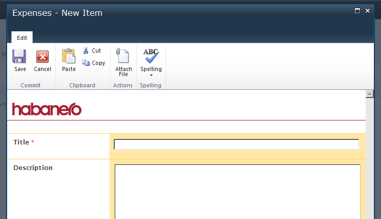
Figure 16 – Customized Nintex Form with Spacer Control
Now we’re going to add some custom CSS to add simple form styling to ensure that fields created with the template always look the same.
I’ve added the following CSS in order to remove the top borders for each label/input pair, change the input’s background color (and other references to that color), and remove the border for the bottom section that gets automatically generated to space the bottom of the form from the buttons.
img.hcf-logo {
	height: 25px;
	margin: 15px 10px;
	width: 135px;
}

.nf-section {
	border-top: none;
}

.nf-form-input,
.nf-item-alternating,
.nf-mobile-form .nf-form-input,
.nf-mobile-form .nf-form-label {
	background-color: #eceeef;
}

.nf-section-bottom {
	border-top: none;
}
To get a better visual sense of the areas that I have customized, I’ve labeled the sections in the diagram below. There are four major classes to be concerned about in a Nintex Form: nf-form-label, nf-form-input, nf-section, and nf-section-bottom.
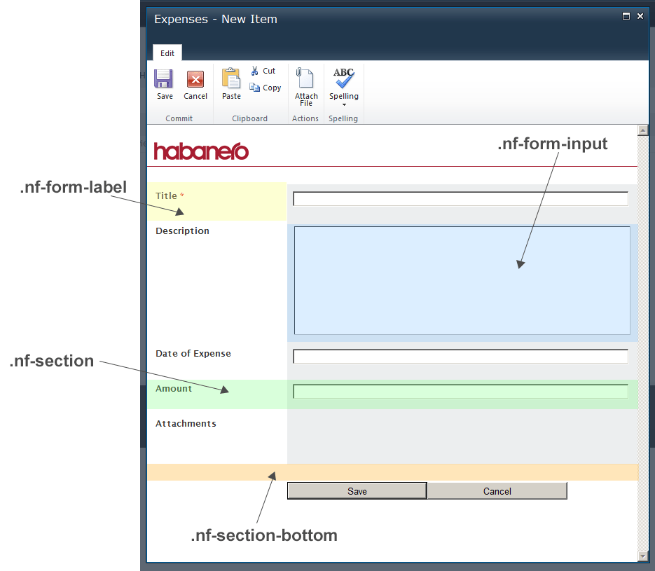
Figure 17 – Nintex Form Styling – Anatomy of a Nintex Form
Now that we have our logo, added some stylistic elements, and a base set of customized CSS in the form, we are ready to create our template!
Once back in our edit mode, we will first need to delete all of the controls from the form for the desktop version (it’s used as a basis for each of the mobile form variations) except for the logo control, border control, and our rich text spacer control.
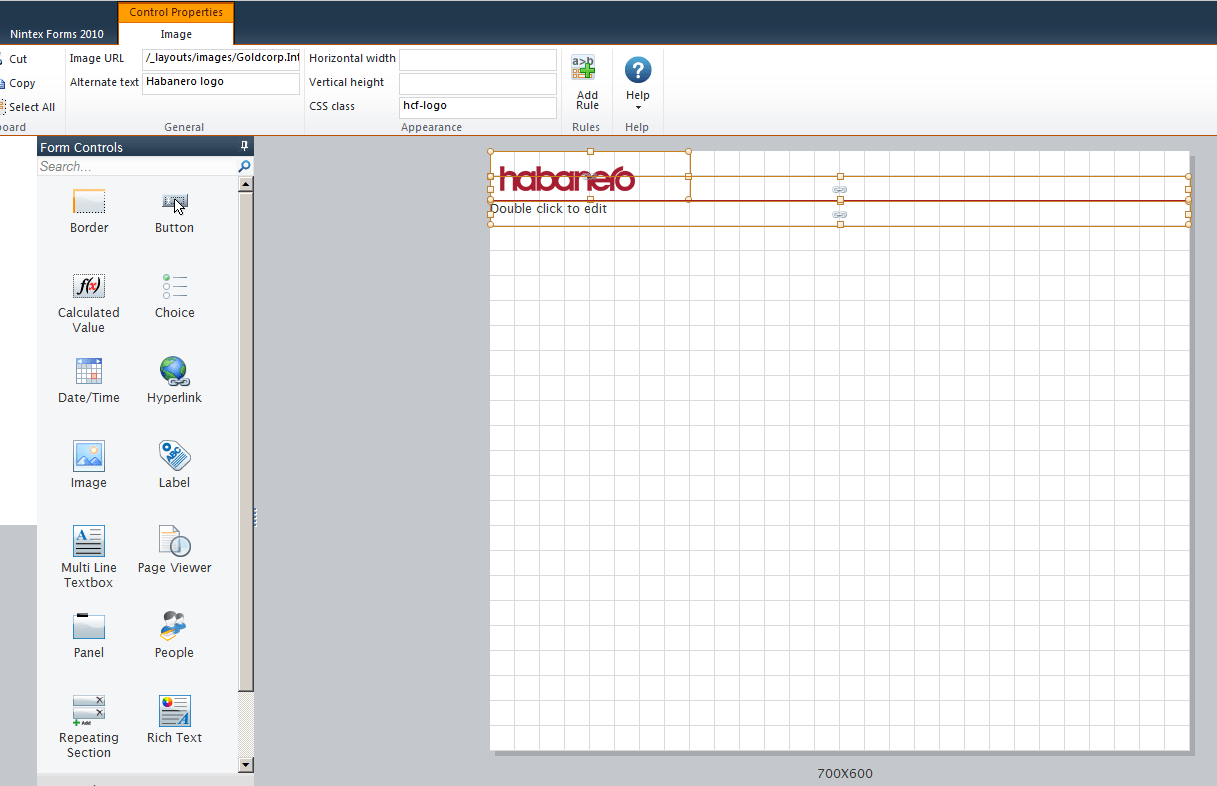
Figure 18 – Customized Nintex Form with form controls removed
Next, click on the “Smart Phone” format of the template. You’ll see that Nintex has inserted a new logo in addition to the three controls you saved. Delete the Nintex logo and move the logo and rich text control upwards so that they are similar to the “Desktop” version of the form.
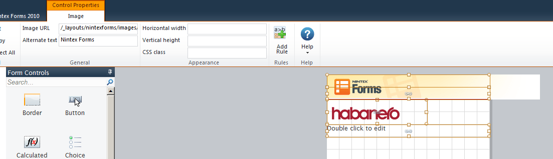
Figure 19 - Before deletion of logo
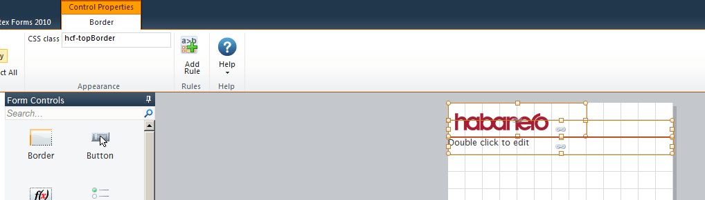
Figure 20 - After deletion of logo and rearrangement of controls
This process should now be repeated for all of the mobile versions you wish to support (the OOTB Nintex Forms supplies user agent strings for the following: desktop, smartphones, Windows Phone 7, iPhone, Android, and iPad).
Now we are ready to export our form. Find the “Export” button in the “Nintex Forms 2010” section in the ribbon and save this XML file somewhere. This is now our Habanero Nintex Forms template!
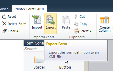
Figure 21 – Nintex Forms Export Form link
We can now remove the Nintex Form from our Expenses form to prepare the list so that we can use our shiny new template. This is accomplished by clicking on the “Delete Form” link very close to the “Export” link in the ribbon.
Now navigate to Central Administration for your SharePoint site and click on the “Manage Device Layouts” in the “Nintex Forms Management” section.
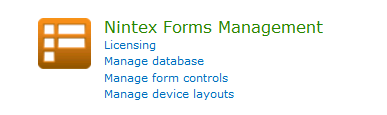
Figure 22 – Nintex Forms Central Administration section
First we will need to remove the current loaded template (if there is one) by clicking on the “Remove” button.
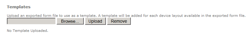
Figure 23 – Nintex Forms manage device layouts – No template uploaded
Next, we need to upload the template that we just created. Once uploaded, there should be a complete list of templates available that appears below the upload area as shown below. This will reflect how many layouts you chose to customize when we were creating the template.
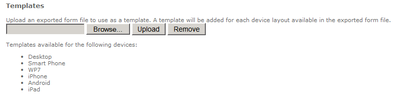
Figure 24 – Nintex Forms manage device layouts - Custom template uploaded
Now let’s customize the form like before, but now it should be using our shiny new added template. After applying the template and publishing it, let’s have a look.
We now have a great starting point and base set of styles for every form that could be created using our template.


