

I recently presented a webinar about responsive web design. We had a lot of great questions and not enough time to answer them all! I wanted to delve further into one question about navigation for deep sites because I know it relates to an issue a lot of companies will wrestle with when deciding whether or not to go responsive.
Responsive layouts give us a chance to rethink traditional navigation approaches. Here are some ways to look at navigation, from the standard to the unconventional.
Scrolling or deep?
The first thing to ask: do you really need all those pages and links? Can you reduce, re-prioritize, or combine content into longer pages? We've seen that scrolling through long pages on touch devices can be a natural gesture because it’s more natural than tapping through a hierarchy of pages.
To figure out if you should go with a scrolling or deep site, an effective content strategy is necessary. Luckily, there are plenty of great examples for both scrolling and deep sites.
Nesting links
A simple, traditional approach that follows established website patterns is to have a tree of navigation that a user follows. An example of a site with a navigation tree three is the CIBC dedicated mobile site:

Three levels of navigation on the CIBC banking mobile site
In this example, you are on the Home > Bank Accounts > Chequing Accounts page and you can go one level further to the content page. The navigation is presented first, and it works by tapping on each section in turn. There are some controls at the top to get back to the root menu.
This is a common approach and we've done this exact thing on other dedicated mobile sites like YVR and CP Rail. The downside of this navigation style is the user waits for a page to load each time and therefore, it can be cumbersome. Navigation trees also don't necessarily explain what each section is about or provide a rich, interesting experience.
Collapsed navigation menus
You can use a simple menu button or icon to hide links. If you have a hierarchy that is wide and has many links at the top, this can be effective. A simple example is our website:

Expose navigation options through an icon
We have nine links as part of our navigation - three main areas and six utility items. They are collapsed under a menu and the focus of the site is more on the content and the embedded links in the content.
You can expand on this with a more complex site by exposing another level in this structure. For example, see how Simon Fraser University handles two levels of navigation:
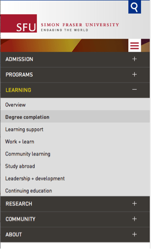
Expand multiple levels of navigation
This model works well if you can simplify your site structure and rely on rich landing pages to help drive people to the right place.
For more ideas on navigation controls, Brad Frost has a great article that discusses controls like off-canvas layouts and carousels in much more depth.
Rich landing pages
Based on my experience, you need to balance a solid navigation approach with the messages or story you need to communicate. This is effectively done through rich landing pages.
The Bill and Melinda Gates Foundation is a responsive site with complex content; they need to communicate about many different global issues, explain who they are, and share their vision to a wide audience.
This site has a short global navigation supported by a dropdown at the top of each page to explore the next level of content. This example is not perfect, but it illustrates some of the challenges of moving a traditional navigation approach to a style that involves longer pages, and in-page links.
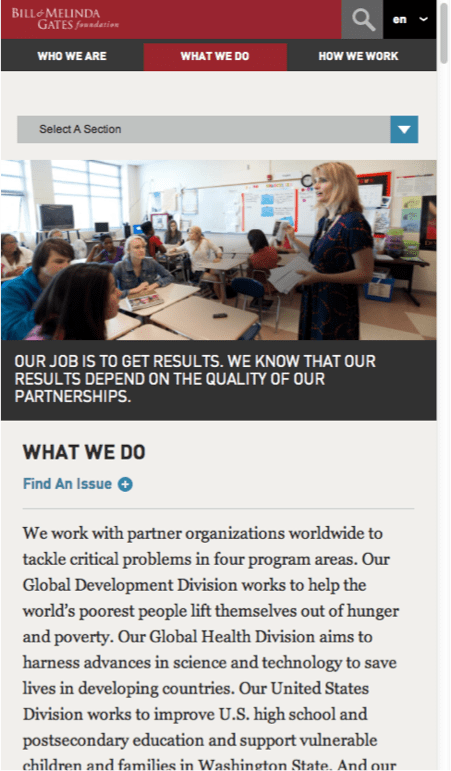
Long pages supported with navigation controls and links
The site doesn't depend on these navigation options, though. You can explore by scrolling through the pages and tapping on embedded links.
Some of the pages are quite long, and they use section jump links to get to the next area.

In-page links to help scroll through long pages
Pivot and explore through the footer
One area that can get forgotten is the footer. For touch devices, especially smartphones, it’s often easier to tap items at the bottom of the screen than the top.
Here is an example from the Windows 8 site that brings together many topics in a simple nested menu. This has the benefit of not cluttering up the local navigation at the top:
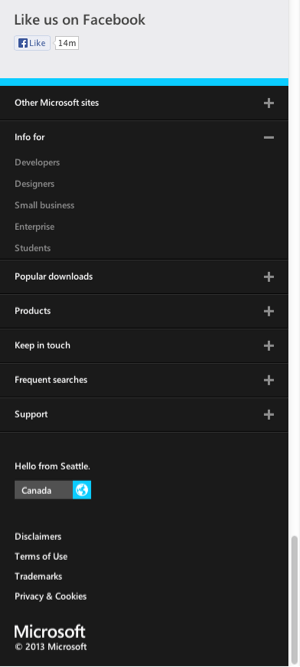
Secondary navigation in the footer
It’s getting more common to add calls-to-action to the footer. On our website, we use the footer for reinforcing who we are and featuring our newsletter signup as a way to stay in touch:

Call to action or next steps in the footer
Throw out navigation and start with search
This seems like a radical approach, but it could work for larger sites, like the one used by the UK government:
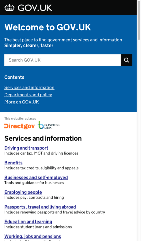
This site has a big search box for citizens who know what they need as well as some links below for the top areas of the site.
It's a simple approach that hides a lot of complexity from users. The downside with search is that people have to know what they are looking for, and you might be missing opportunities to communicate important messages.
Split navigation
Another emerging structure that intrigues me is split navigation because it accounts for the ergonomics of how people hold devices. I haven't seen any complex sites use this, but it's something to keep in the back of our minds going forward I think. You can read more about this idea from Luke Wroblewski's article.
There are several variations and prototypes available in Wroblewski's article. This is one example of what a split navigation across 2 areas across the bottom of a screen could look like:
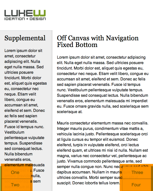
Highlighted in orange is an example navigation control that is split across the screen
I could see this type of control being really valuable for not only responsive websites, but also complex areas like policies and procedures or manuals on an employee portal. Being able to switch between sections or move between related pages could be supported with an approach like this.
These observations are based off of my experience working with clients in diverse industries, but I'm always happy to learn what other people recommend. What approaches have you seen or tried to set up navigation for complex sites?


