

There’s a lot of ingrained thinking out there about what a design process should look like.
From the client’s perspective, why should the process change if the results have always been favourable? Clients should still be shown the benefits of switching to a more iterative, fluid process, even if the traditional mockup process has worked well for them in the past.
Any way you look at it, the design world is shifting. Having a responsive, adaptive, mobile story is becoming more and more important. Significant numbers of users only access your site on a mobile device, and devices have widely varying screen sizes and capabilities. The option of having one fixed site design is no longer practical.
Let’s examine the ways a responsive, adaptive, atomic design process can benefit clients:
Time and budget efficiency
The atomic design process shifts the focus from pixel perfect, 100 per cent content-filled mockups to a continually evolving set of content, atoms, and molecules. A continually evolving design process allows us to add fidelity along the way, and we can move pieces that usually fall later in the process to the beginning.
Front-end developers can begin to create the code for the various molecules and organisms as they are defined. They can even start to work and assist with the maintenance of a live prototype along the way. Back-end developers can work on functionality that’s been specced out.
You should be able to potentially deliver on a shorter timeline than with a traditional approach because of this new time efficiency. We’re already seeing some gains in this area at Habanero, but we feel the best is yet to come.
Plus, because of time savings, you could start to see decreased budgets and less risk of projects going over budget. It may not happen immediately, but the trend is there. When everything is firing on all cylinders, you may be able to deliver a fully responsive site for the same or even less effort than you could have delivered with a more traditional process.
Quicker revisions
By shifting to evolving prototypes and component designs (like our atoms, molecules, etc.), you can make changes faster. Want to explore if a different line height might help your design breathe more? Change one line of code in the prototype and see your changes instantly. That same change in Photoshop could have taken hours or days depending on the number of mockups and the complexity of the designs. Now? Less than five minutes. Want to change the hover state color for a button? Boom. Easy.
Baked-in mobile
Oftentimes a mobile site or approach is put on the back burner when budgets are tight, resulting in mobile either being cut from scope or pushed to a phase two that may or may not see the light of day. The mobile story is hugely important today, and by approaching things from the ground up with atoms, molecules, organisms, and a focus on responsive design, mobile is baked in. It’s just too important to push back for a later date.
Lower risk
When the process is dialed in, it can be much lower risk to your team and to the client. Problems in content, design, functionality, and coding are revealed and dealt with much earlier in the process. Utilizing prototypes along the way allows the teams to visualize the whole site sooner, making reviews and tweaks easier to address.
It’s easy to create a pattern library
Creating atoms, molecules, and organisms helps us create what are essentially reusable pattern libraries. These patterns make rapid prototype creation and management even easier for the future.
Let designers think about systems
By focusing less on mockups, spending less time making minor changes/tweaks, and focusing more on components, designers are freed up to think more universally about the design system for a particular solution. It’s much harder for a designer to get caught up in a specific item and easier for him/her to look at more universal decisions that often get missed. Things like typographic hierarchy being consistent, line heights, base units, interaction patterns, and more.
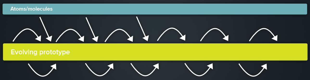
Imagine incorporating a library of atoms and molecules in an ever-growing prototype to build your solution's user experience to meet business needs.
And more
There are so many reasons to take this responsive, adaptive, atomic approach to design — even more than we’ve listed here. Hopefully these will help you consider this internally or help you convince clients that this is the best way forward.


