More often than not, as interaction designers, we are promoting the act of getting real content into wireframes to help evaluate and inform the content refinement and visual design. Yet why is it we don’t always use client’s brand typography in wireframes?
I had the good fortune of attending the Emily Carr-hosted Web Type West 2014 a little while ago. Zara Vasquez-Evans’ presentation, “Graphic Design and Typography for the UI Designer,” is one that especially resonated with my day-to-day work.
Zara has great perspective on the creation of the wireframes and how, in her experience, certain wireframe approaches can misinform client expectations for content. I’ve encountered this myself as well and it really encouraged me to step back and consider why this is.
A wireframe is not meant to convey the look and feel of a website, but it serves as a blueprint for layout and content. Yet such a simple consideration as using the client’s brand typography can really impact numerous elements. Text wrapping can change dramatically between different typographic choices, which tends to often significantly impact homepages and landing pages where content is carefully crafted into key messages, call-outs, and roll-ups.
As we consider responsive design, text wrapping can be particularly concerning. By including the client’s typography at the wireframe stage, this can give content creators more insight into how their content will be translated, opening up additional dialogue between designer and content creators to evaluate these decisions.
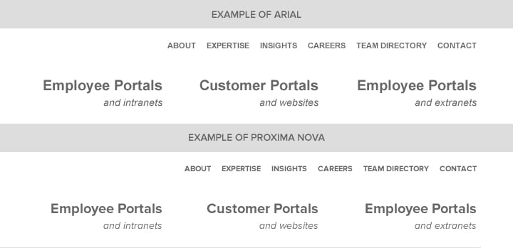
Proxima Nova is Habanero's brand font. Arial is a general placeholder font. Which one gives you more insight into how the content will look?
This can also aid with the review cycle for wireframes. Occasionally, we encounter stakeholders who cannot get past the greyscale nature of wireframes. Frankly, it’s worth exploring if stakeholders have a greater connection to wireframes that leverage their organization’s typography. Certainly, I would imagine that the increased degree of familiarity couldn’t hurt.
Zara’s talk also helped illustrate that informed typographic decisions can be as simple as leveraging the client’s brand typography or it can extend further into additional layers of complexity. Such considerations could be line height and font weight, but for some individuals, this might go too far into the territory of visual design.
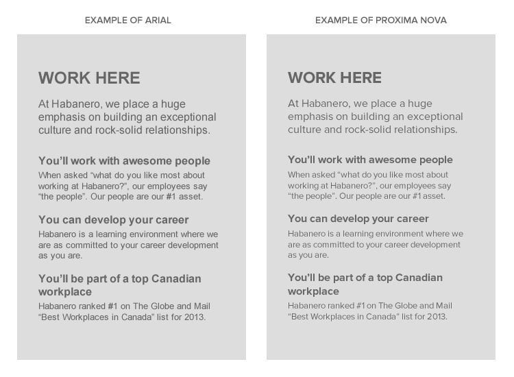
Again, which one of these wireframes would help Habanero stakeholders visualize content?
Obviously, this approach is stifled when you’re working with a client with a brand in transition. Even in these cases, there is often still a means of getting insight into some of the typefaces under consideration. It might just be as simple has reaching out to the brand team with a few questions about the new typography.
Ultimately, I think considering typography at the wireframe level is a low investment with a potentially high return. The more time we can spend refining content and thinking about how content should be presented, the more prepared and equipped the client is to make decisions around content.


