

Every project manager that I have ever worked with has one piece of information they always want to know – “where are we?”
This is a very simple question that requires a very complicated answer. The mistake a lot of development teams make is to try and give the most positive spin on the situation, because each member of the team is thinking only of the piece they are responsible for, rather than measuring the progress of the project as a whole. And because IT tends to be full of raging workaholics who will never admit they are overloaded and in need of help, no one can be objective enough to assess the situation.
However, even if we go with the old adage, “you can’t manage what you can’t measure,” you have to determine the key performance indicators, find a reliable source for that information, and then figure out how to incorporate the findings into a decision making process that enables course corrections throughout the project to address risks and problems.
Another important thing is to get everyone on the team to understand what the numbers mean, what actions need to be taken to address them, and who is accountable for those actions. That last part, the communications piece, is critical.
On a recent engagement, I was producing graphs and metrics to show in a condensed format how well the team was proceeding toward the goals of the sprint and project as a whole. I thought these were an incredibly clear and concise way of showing exactly where a project was at any given moment, and I couldn’t understand why my beautiful graphs and charts weren’t being understood by the intended audience.
The reason for that is simple: The audience didn’t speak metrics and I hadn’t clearly explained the metrics I created.
Creating a metrics dashboard
My information was rolled up into a dashboard that looked something like this:
This would tell me everything I needed to know very quickly, but for anyone else it said nothing at all—except that green meant good. I would be running around saying something that probably sounded like “It’s 17! Why are you not all reacting to the 17-ness of the situation that we are in? And this here? It’s BLUE! Blue is bad, are you blind?” and see only uncomprehending stares.
It was a pretty frustrating experience for both sides!
To avoid confusion in the projects that I work with from going forward, I thought I’d give a high level overview of what that dashboard tells me about this project, so that maybe next time I won’t feel like Sherlock Holmes yelling “Vatican cameos” without someone to interpret what that means.
In my above dashboard example, sections A, B, and C can be used to measure how well the development process is going. Section D shows each team member their current workload. Sections E, F, and G can be used to assess how the QA process for the project is going.
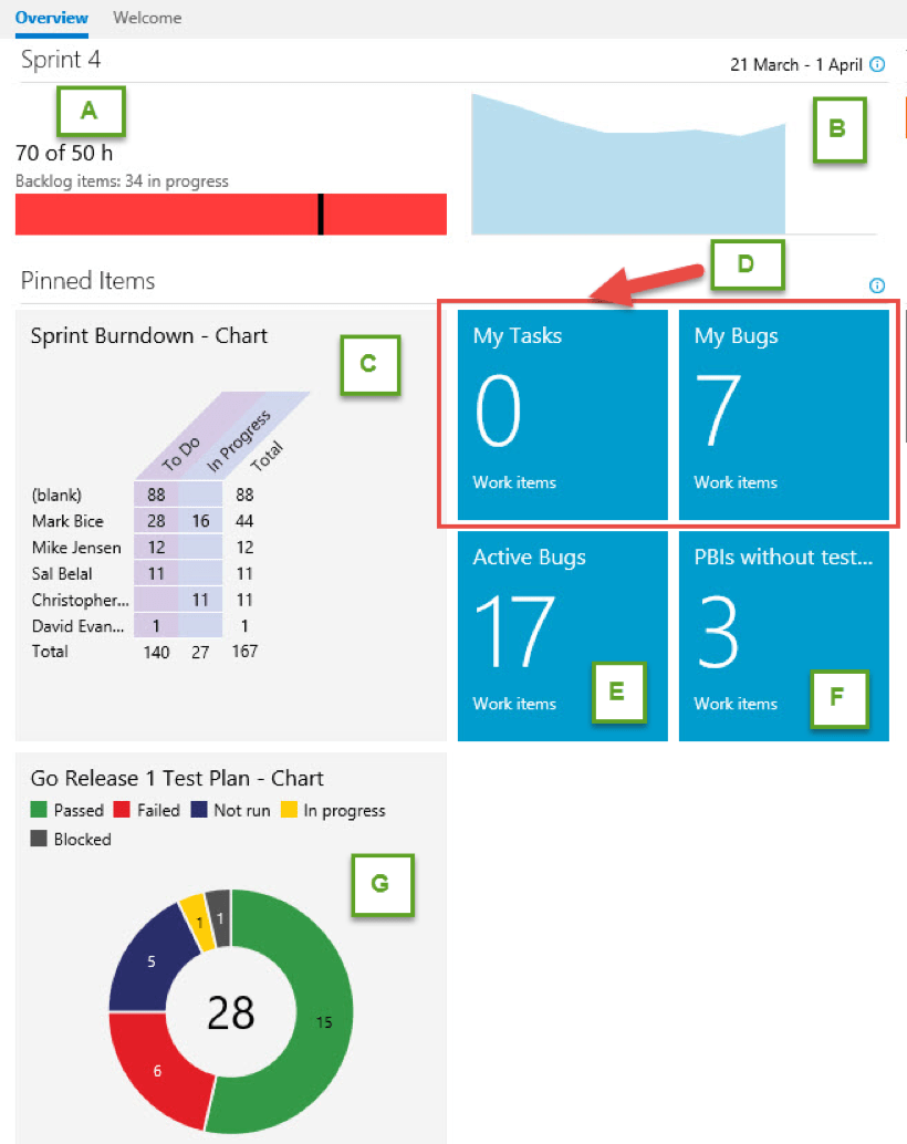
Section A: Remaining work compared against the team’s available capacity
 Here, it looks like the team is falling behind on the work that was planned for this sprint.
Are they really? Or are people not keeping their tasks up to date? Is this an accurate assessment of where we are, or is the source of truth not reflecting reality?
As this is sprint four, we can compare the amount of work completed previously to see if we are chronically over or underestimating the workload and feed that back into our sprint planning process.
To find out what is really going on, you have to read the other two development-related charts.
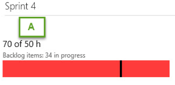
Section B: The rate the team is completing the work
 Ideally, the team will knock tasks off at a steady pace throughout the sprint, so I added the ideal trend line to illustrate that more effectively. It looks like the team started out at the ideal pace, then plateaued for a little while, then, for some reason, more work was added.
What happened there? Was more work found? Was scope added in the middle of a sprint, against agile best practices?
We’d have to look at the work backlog to get a bit more insight into what is happening here. Which brings us to section C, which I realize I should have changed the name to “release burndown.”
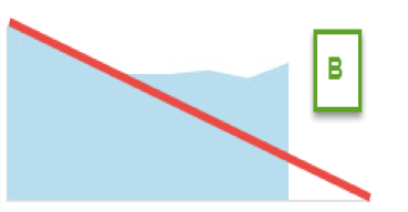
Section C: Release burndown
I removed the sprint filter because it was our last development sprint before being feature-complete, so if you will forgive the retcon:
For some reason, Mark has more work on him than the other developers. Why is that? Is Mark not updating his tasks, and this is inaccurate? And what is up with those 88 hours of work not assigned to anybody?
This chart is configured so that you can click through and see what tasks remain, giving you the information you need when you talk to Mark to see if he could use some help, and insight into what those unassigned tasks really represent.
If this was filtered to show only the current sprint’s backlog, it could be compared to section A. If Mark just hasn’t updated TFS, then no actions need to be taken except to clean those up.
If, however, his work needs to be redistributed, then should it go to one of the other developers? Thankfully this chart also shows the capacity the other developers have available so we can decide who should take on additional work.
Section D: Work that is assigned to the currently logged-in user
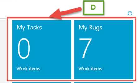
This part is pretty straightforward. I have no active tasks assigned to me that I have not already completed, but I have seven bugs waiting for my attention. Each of these is clickable so I can see bugs and tasks in more detail.
Sections E, F, and G
These should really be read all together, so this may get a little complicated.
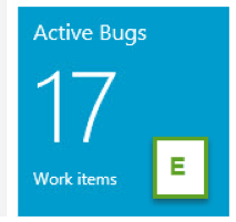
Section E seems straightforward, but is a little more complicated than it appears. This is a measure of the number of reported bugs that no one has looked into yet.
But, is 17 bugs good or bad? How are they distributed? Evenly throughout the team, or does one person have 12? How serious are the bugs, and do they need to be prioritized? And if this number was low, does that mean that the sprint features are getting stabilized, or does it mean that no one is testing it yet?
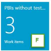
This brings us to section F, which indicates how many requirements don’t have test coverage yet. This project used the scrum process template so requirements are referred to as product backlog items, or PBIs. Ideally, all PBIs will be associated with at least one test case, so that we can ensure that all features get tested and nothing falls through the cracks.
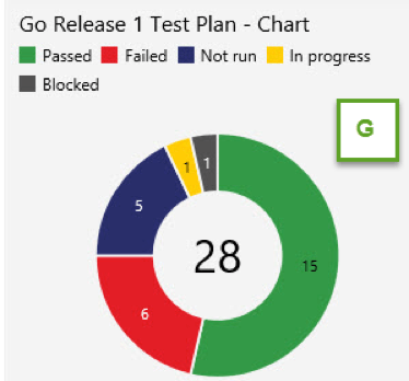
Even if the untested requirements number is low, and the bug count is also low, then that is still not enough to say how well the project is going without the last chart G which shows the test results.
Scenario One: E is low and F is high, G may or may not have test results
This means that the test results don’t tell us as much as we would like to know. Section G is just going to give us results for the test cases that we have written and the PBIs that we have been testing. But what about the PBIs that aren’t covered? What state are they in? Why is no one looking at those?
Scenario Two: E is low and F is low, but G shows that most test cases have not been run or are blocked
This makes the argument that the bug count is artificially low, we are in a position to test the features, but the tests haven’t been run yet and we should look into what is happening that prevents this from happening.
Scenario Three: E is low and F is low, G shows a lot of failures
The most likely explanation for this scenario is that the testers are behind in verifying the bug fixes that have been checked in, and regression testing the test cases that have failed.
Why are the testers falling behind? Do they not have access to test the bug fixes, and a new build should be deployed to the QA environment? Are the testers even aware of what has been fixed and is waiting for their attention? Or are the failures not being raised as bugs?
Scenario Four: E is low and F is low, and G shows mostly passes
This is when we can have some confidence in the stability of the features. As features pass testing, we can measure the progress of the project as a whole. Passes can be safely ignored until final regression testing is ready to start, and the team can focus on what failures are the most important to fix first.
Conclusion
Projects are huge, complicated beasts with many moving parts, and it can be extremely difficult to keep track of what needs attention and what is just noise or administrative backlog. A good metrics dashboard can help sift through that information and surface what areas are most in need of attention, preferably while the problems are still small and manageable hot spots and before they become fires that need to be put out.


