

As part of our journey to embrace accessibility in design, we’re sharing a series of insights that document our process and learning. In our last post, we talked about how to use motion and animation with accessibility in mind. In this article, we're going to talk about a design trend that has gained a lot of popularity over the past couple of years: dark mode.
We love that dark mode gives users an option around how they want to experience your site. When done right, dark mode can enhance accessibility. It’s not as easy as it seems, though. Dark mode requires an intentional approach to design and a solid understanding of accessibility best practices. In this post, we’ll share our tips for great dark mode design.
What is dark mode?
Dark mode is the colour scheme of any interface that displays bright text and interface elements on top of a darker background. It’s designed to supplement the default light mode. Dark mode isn’t as easy as flipping a switch from white to black. When you’re designing for dark mode, you’re creating two versions of the same design. That means double the work.
How long has dark mode been around?
To truly understand dark mode, we need to take a step back and see how this all started. Dark mode actually predates light mode by a couple of decades. For the very first computer screens, dark mode was the default. Back then, monochrome CRT monitors contained phosphorus, which made them appear dark. They could only display a single colour, defined by the type of phosphorus used, which at the time was most commonly green (flashbacks of The Matrix, anyone?).
Light mode: a more familiar experience
In the early 1970s, Xerox introduced light mode with its first “personal computer,” the Xerox Alto. Light mode was successful because it looked not only friendlier than dark mode, but also familiar. It was designed to mimic the look of ink on paper – something we see all the time!
The comeback kid
Dark mode made its first return with the Windows Phone 7. In 2019, it really made a comeback when Apple introduced dark mode for iOS 13 and iPadOS to create an environment that's easy on the eyes and helps users focus on their work. That same year, Google officially rolled out dark mode with the release of Android 10. Apps such as Gmail, Slack, Soundcloud, Twitter, Instagram, Facebook and more followed suit.
Why dark mode has gained popularity
There are many reasons why dark mode has gained popularity in the past couple of years:
- After using light mode for so long, it feels new and exciting.
- It was adopted by tech giants such as Apple, Facebook, YouTube and others.
- Developers have been using dark themes for a long time.
- Most entertainment and gaming user interfaces (UIs) tend to have dark themes (i.e. Netflix).
- Dark mode improves the battery life of a device. White pixels are more power hungry than black pixels, so they use more energy.
More importantly, dark mode has gained popularity because of the benefits it provides from an accessibility perspective:
Dark mode minimizes digital eye strain
We stare at screens for most of the day. This can lead to something called computer vision syndrome (CVS), with symptoms that include eye pain, blurred vision, double vision, headaches, neck/back pain and more. The good news is that switching to dark mode can help reduce these effects.
Dark mode increases visibility in low-ambient lighting
Dark mode reduces bright light, making it easier to see in low-light situations, such as late at night or early in the morning. This benefit is especially important when we think about our world today. We’re not doing our work in one place, or at set times like we used to, so having a choice between light and dark mode means that we can adapt our technology to suit our environment.
Why designing for dark mode matters
Companies with a dark mode version of their website have it for a reason. They’ve put in the time and effort to create an alternative experience that is inclusive of all their users and their preferences. This is the real reason why designing for dark mode matters. From an accessibility compliance perspective, you’re not breaking any rules by not having dark mode, but there’s still the broader inclusion perspective to take into account. When we think about designing for accessibility and inclusion, there’s a ton of overlap. In both cases, we care about giving users a choice, so that they can access technology in a way that makes sense for them, no matter what their abilities are. If users can’t switch between light and dark mode, we’re removing another choice for them.
Dark mode and the recent White House website redesign
We haven’t done any dark mode projects ourselves, so we thought we would take a look at a site that has done an exceptional job implementing dark mode: The White House website. Biden’s administration redesigned the White House website around the idea that the White House is the people’s house, so creating an accessible and inclusive experience was top of mind1. The site includes features such as the ability to increase text size for optimal legibility, multilingual (English and Spanish) content and the option for users to include their pronouns when submitting contact forms. Most notably, they’ve done an awesome job creating a seamless experience between their light and dark versions of the site while incorporating dark mode best practices and principles.
Dark mode principles in practice
Dark grey is the new black
One of the first rules of dark mode is to use dark grey (#121212) in place of true black (#000000) as the primary background colour. Dark grey surfaces, unlike pure black, make it easier to express a wide range of colour, elevation and depth, because it’s easier to see shadows on grey.
You may be wondering, how big of a difference does this colour change make? On the White House site, they use Google’s Material design system standard background of #121212. If we switch the background to pure black, the difference isn’t startling, but you can see that the cards on the dark grey side look more elevated, while the cards on the pure black side look flat.


Desaturated colours work better in dark themes
Using saturated colours on dark surfaces can create the optical illusion of vibrations, which can cause eye strain for viewers. That’s why we use desaturated colours. Although they look pale and pastel in colour, they are easier to read against dark backgrounds. When you do use colour, use them as accents. Dark themes should use limited colour so that the majority of space is dedicated to dark surfaces.
In the case of the recent White House website redesign, the iconic white, blue and red are all problematic in dark mode primarily because the blue and red don’t provide enough contrast. What’s interesting is that they’ve introduced a new light gold colour into their palette, which creates continuity between the light and dark experiences. It doesn’t seem like an obvious choice, but it works well as an accent on light mode and then becomes the dominant colour choice for dark mode. This creates the feeling of intention and continuity as you move between the two experiences instead of the unfortunate and very common situation you’ll see in most dark mode designs: a jarring transition that bears little to no resemblance to the brand or experience of light mode.
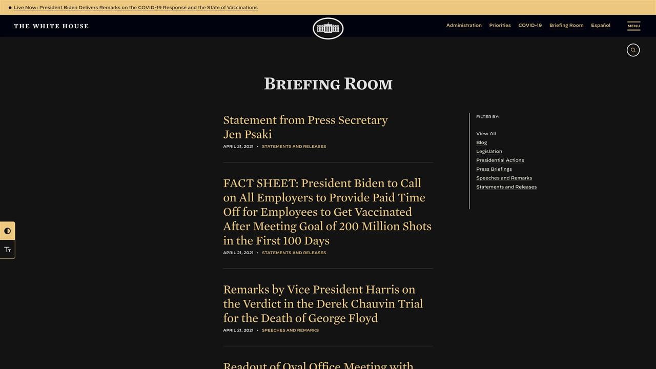
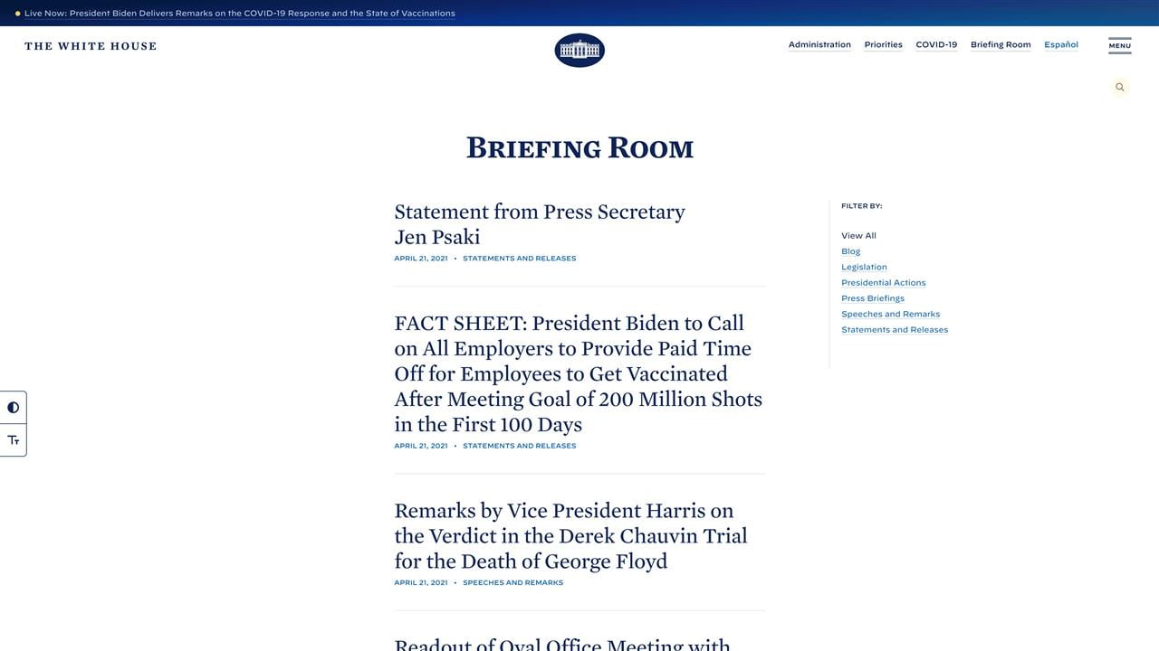
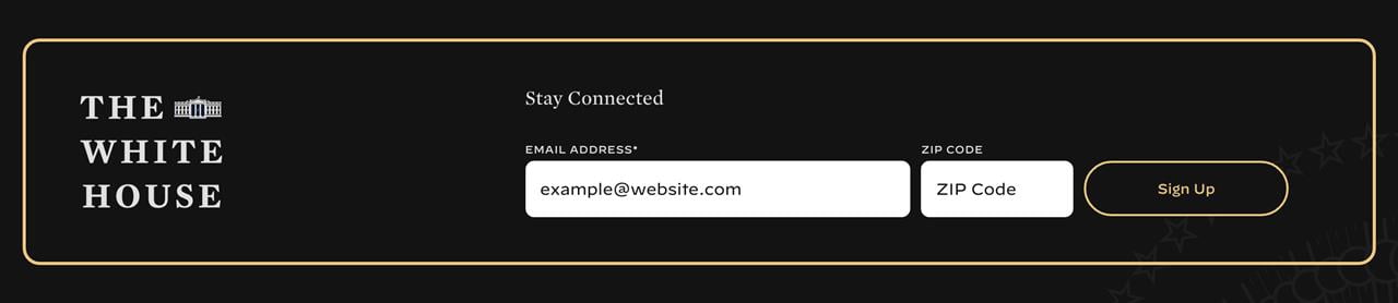
Avoid using pure white and use different shades to indicate hierarchy
When you’re designing for dark mode, it’s best practice to use minimal amounts of pure white (#FFFFFF) as it can visually vibrate against backgrounds (similar to what happens when you use saturated colours). Instead, different shades of white and grey should be used.
That being said, creating elevation and depth are key elements to any successful dark interface. One of the rules of dark mode is: the higher a layer is, the lighter it should be. This creates a visual hierarchy that implies which information is more important for the user.
On the White House website, they’ve used different shades of white strategically to indicate hierarchy while preserving proper contrast levels. They have used a slightly darker shade of white for text and kept the use of pure white limited to their call-to-actions, which you can see in their newsletter sign-up form. This use of pure white makes the form stand out even more in dark mode than in light mode.

Is dark mode right for your organization?
The biggest drawbacks of creating a dark theme for a website are cost and time. These two factors can make it difficult to make a business case for adding a dark theme, but there are other reasons why you might consider designing a dark mode for your site:
- You’re embracing accessibility, and this is an extension of that.
- As part of your brand purpose and identity, you want to give your customers or audience more control.
- You’re going through a brand refresh or creating a completely new brand identity and want to plan for the future.
Uncompromising design
Although dark mode may not technically be considered an accessibility feature, we feel that it’s still important to talk about the value that a dark experience can bring to users and how accessibility is still of the utmost importance. Using these dark mode best practices, you can bring in the positive aspects of immersive storytelling while still caring about accessibility.
1 Fast Company: Under Trump, WhiteHouse.gov was a disaster. Biden’s team revamped it in 6 weeks (read the article)


