

To share our evolution, we’re starting this accessibility insight series. In each post, we’ll share our latest thoughts, strategies and techniques for inclusive and accessible design. We’re aiming to break down the myth that accessibility hinders creativity. We believe great design is accessible for everyone.
In this post, we’ll tackle one of the most common design patterns that you can find in almost any website: text on photography. These real-world examples show how some design decisions can negatively impact the user experience, when accessibility isn’t considered.
Why text contrast matters
As cliché as it is, everyone knows that a picture is worth a thousand words. Photography not only adds visual interest, but can also set the tone for your website, bring your brand to life and make an otherwise simple design distinctly yours. Photography plays an important role on websites, so we often see text placed directly over a photo to take advantage of the visual emphasis and direct attention to the content and messaging. While in theory this makes sense, in practice it can often go wrong. Photography is dynamic across different breakpoints, so it can be difficult to ensure there’s proper contrast preserved between text and photography in every situation.
Text on photography gone wrong
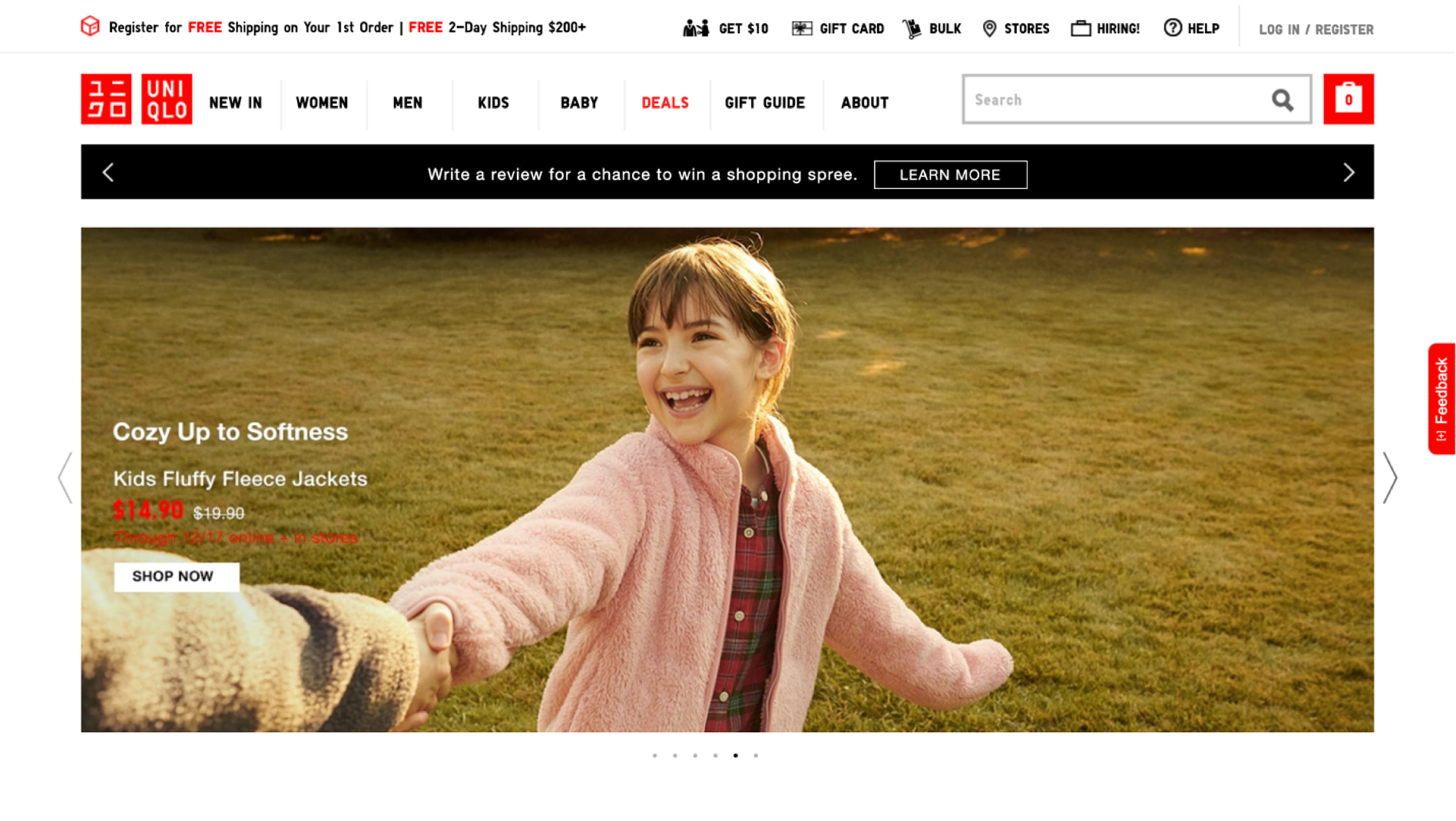
UNIQLO
When a key message of your website isn’t readable, it’s a big deal. In this example from UNIQLO, both the price and crucial terms and conditions, including the duration of the sale and whether it’s online, in-store or both, are very difficult to read. When users can't read text on top of images, they are more likely to skip over your content.

Samsung
Some organizations go beyond layering text directly on photography to also include functionality. In this example, Samsung uses a text-based tab switcher directly on the background photo. This is problematic because information is buried beneath a tab that isn’t visible.
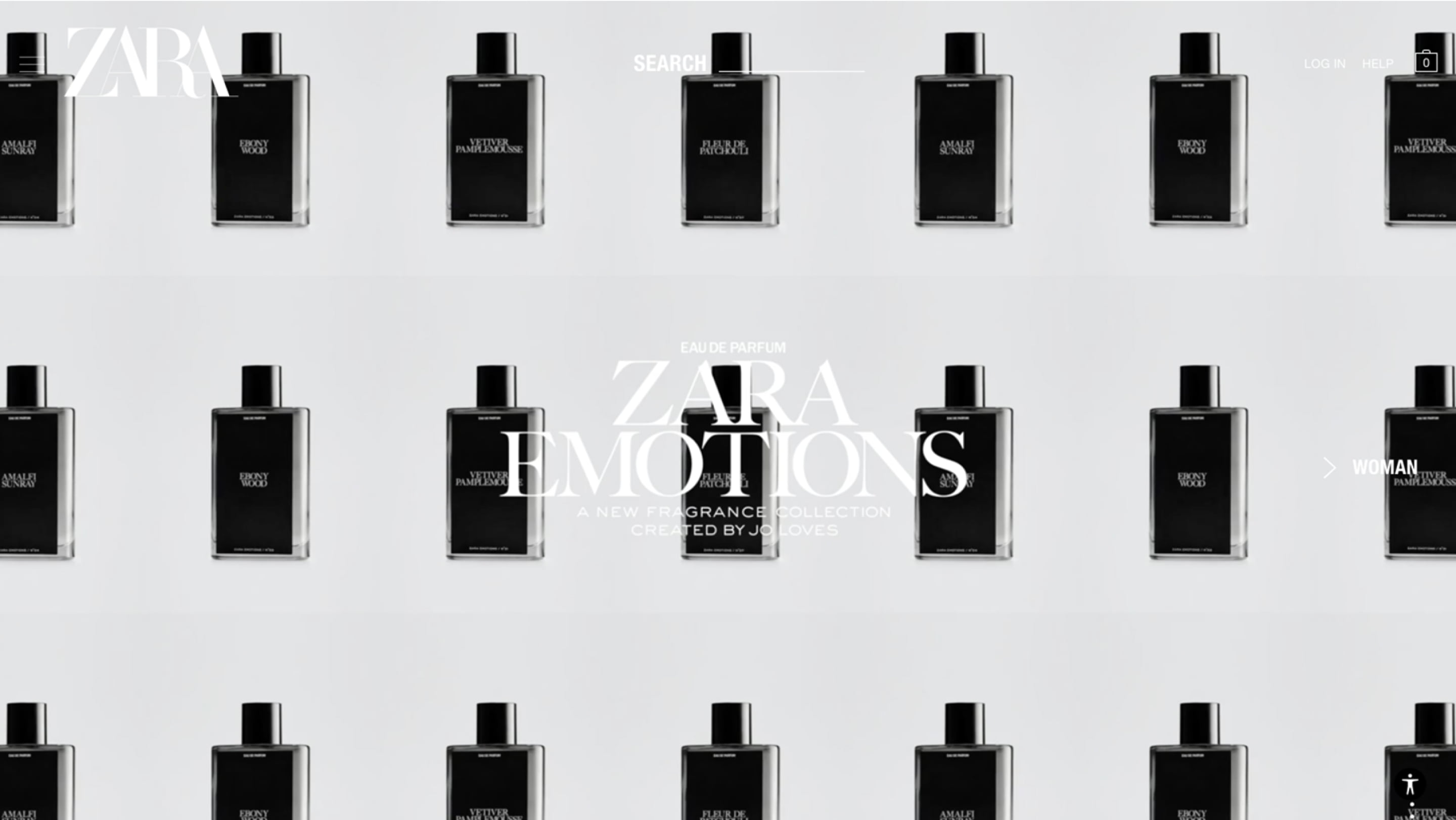
ZARA
Another trend that’s becoming increasingly prevalent is text on immersive full-screen video. Again, in theory, this sounds and initially seems eye-catching and visually striking. But in practice, not only is the key message lost, but the navigation is also compromised. The strokes on the navigation menu are too thin to be visible against the light grey background. The white text of the search text and line are lost. And finally, the login and help options blend right into the background. This leaves the user near helpless if it weren’t for the accessibility controls, but you must change the experience for yourself to make it accessible.
Alternatives to text on photography
Photography, colour and illustration hybrid
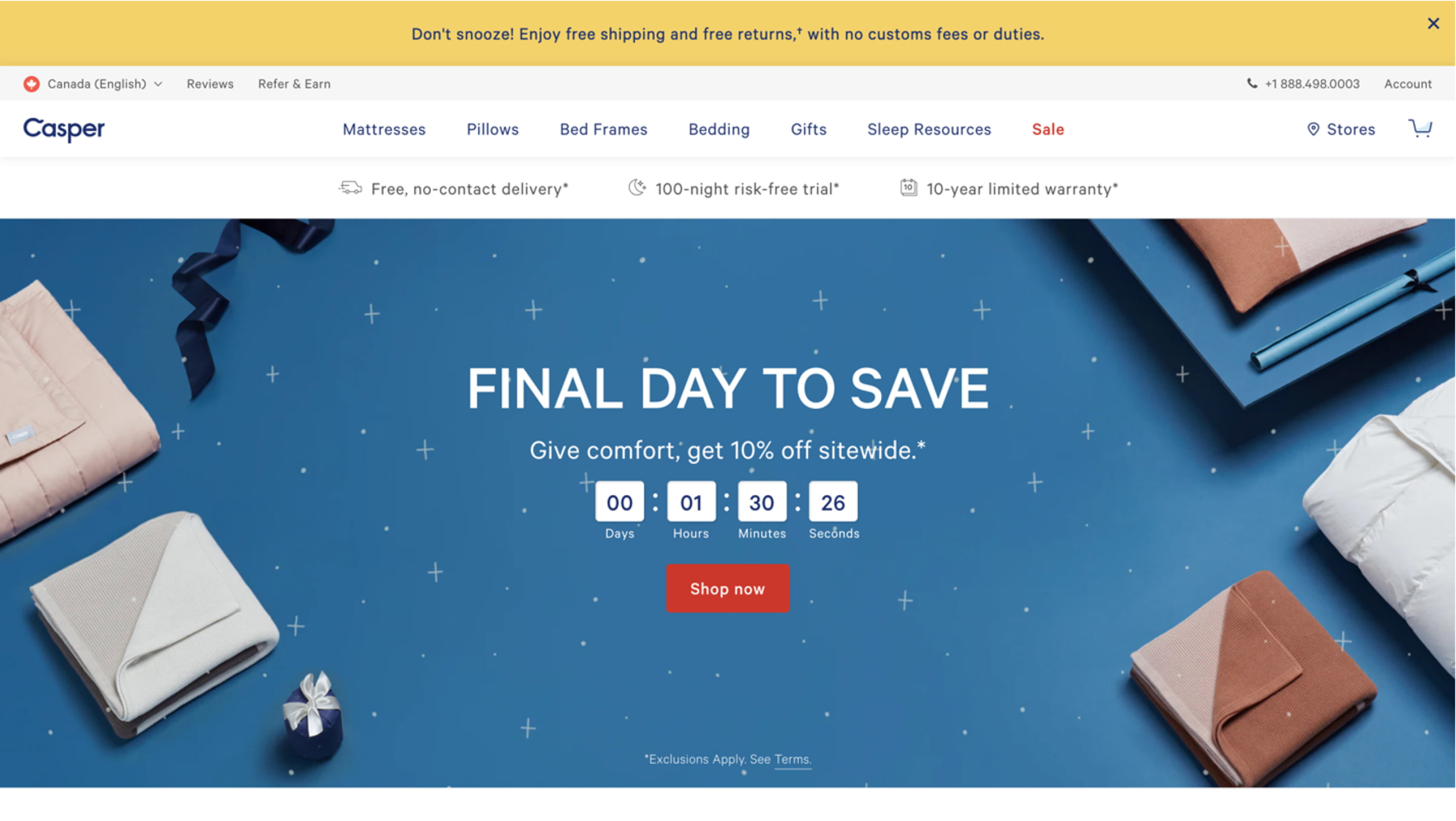
Casper weaves together photography with background colours and illustrations to create generous space for text to exist without risking overlap with the photographic elements across all breakpoints. This effectively provides the best of both worlds: the photography elegantly frames the content, drawing the user in and anchoring the focus on the text. They also ensure that white text sits on darker backgrounds; where text overlaps with a light background, it changes to a darker colour.
Photography blending and blur
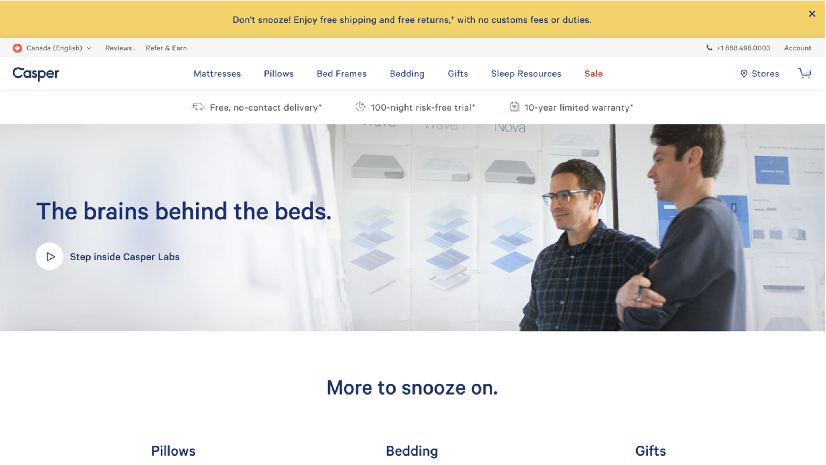
In this example, Casper exaggerates the blurred foreground in the photo to ensure there’s sufficient context even though the text is overlaid directly on the photo itself. Upon close inspection, the blur likely takes liberty with photographer’s intent, but by exaggerating the existing blur, it still feels natural. In almost all cases where blur is applied, it’s on the portion of the photo that is not important, so it doesn’t take away from the overall experience. Instead, it brings focus to the overall concept, figuratively and literally.
Cutout and colour blocking
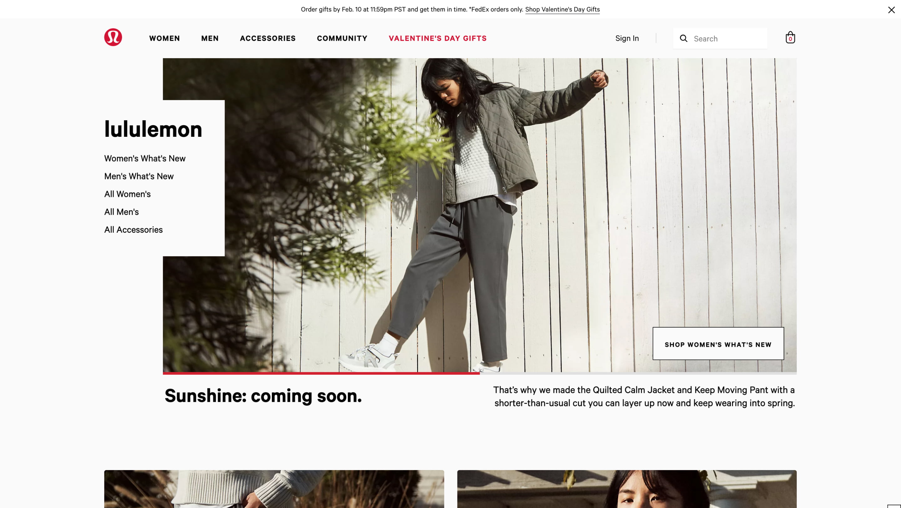
With this technique used by lululemon, there’s a shift away from edge-to-edge photography and the background colour of the page extends into the photo area, creating a cutout effect. This achieves something very similar to the previous examples where the cutout creates visual prominence and helps draw the eye to the text area. It also allows for very high contrast between the text and the light background colour, offering the most accessible experience so far.
Our recent work with Toronto Pearson
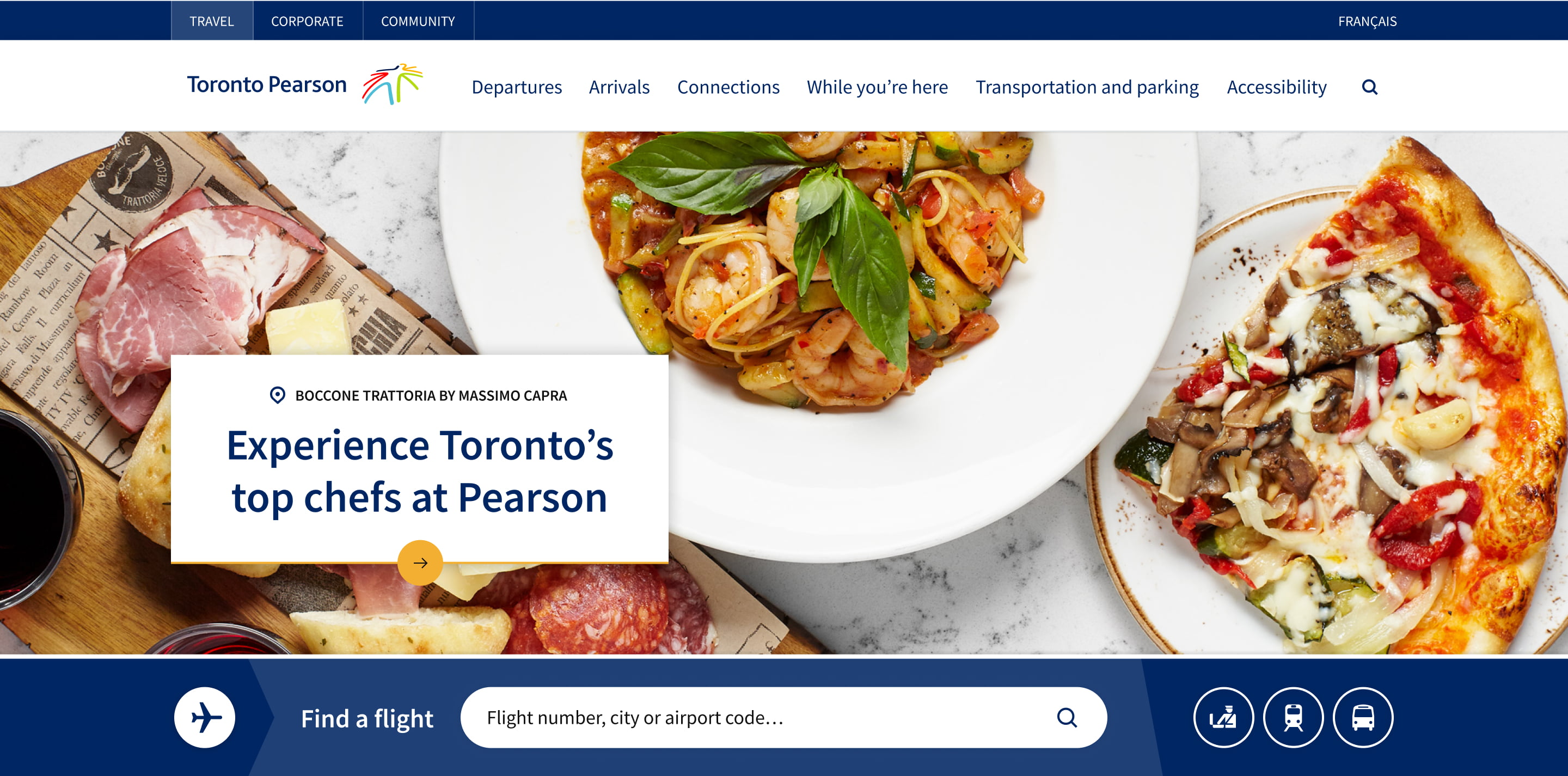
Similar to the lululemon example, our work on the recent Toronto Pearson website redesign applies the colour blocking technique. Instead of the cutout approach, we’ve applied edge-to-edge photography for a more immersive initial experience to draw the visitor in. We’ve still applied the same technique of using the page background colour, in this case white, so that again, there’s very high contrast maintained between the text and background.
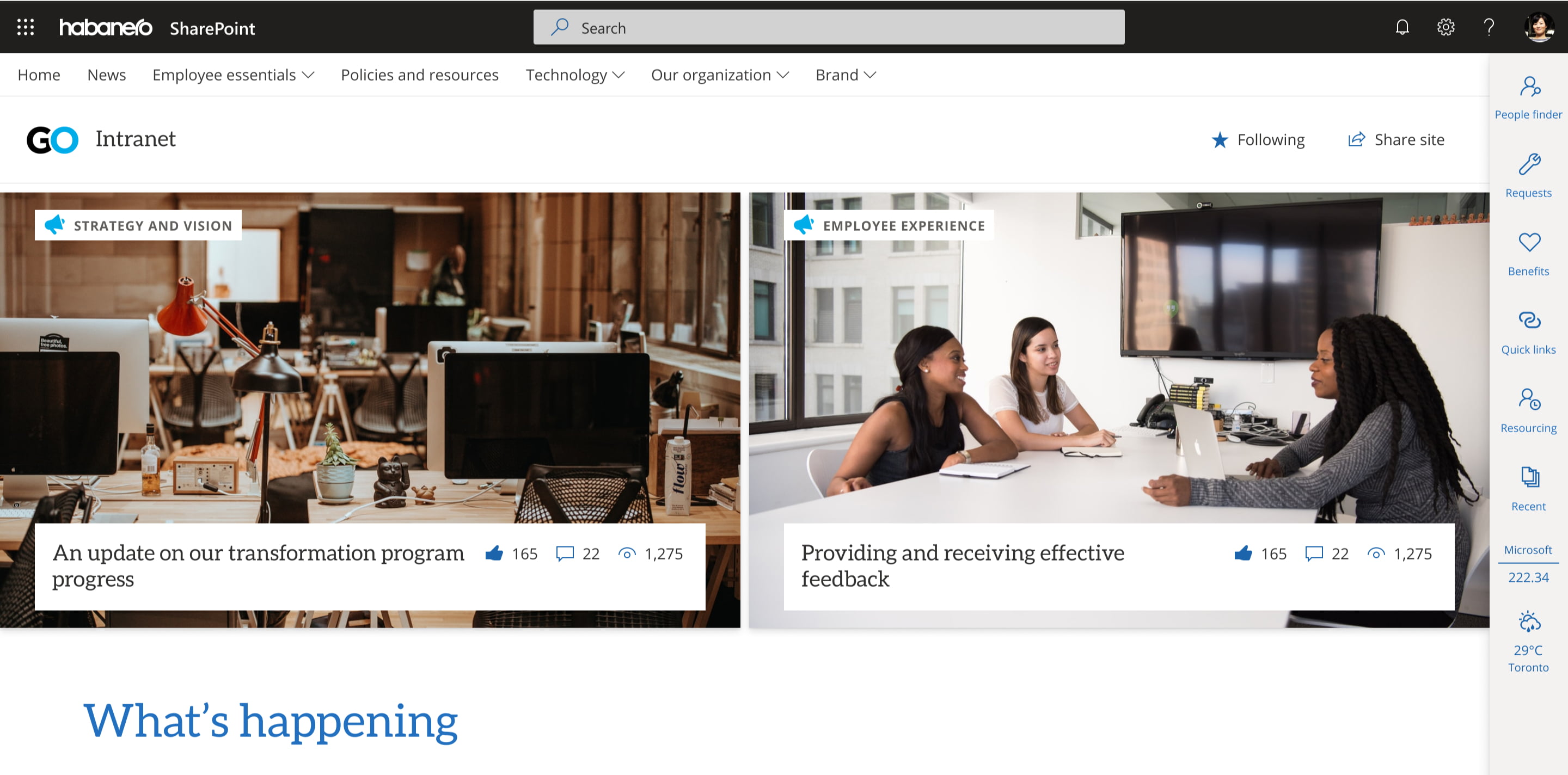
Accessible modern SharePoint intranets
Accessibility is also top of mind when we design intranets.
When building SharePoint intranets, we start with Microsoft’s theme designer to choose a colour palette that meets our accessibility standards. The built-in accessibility checker makes it easy to verify that the primary colour, text colour and background colour work together from an accessibility standpoint.
We designed GO modern web parts for accessibility. On the home page, we’ve made sure that any text overlaying images appears in a white box, so it’s always easy to read.
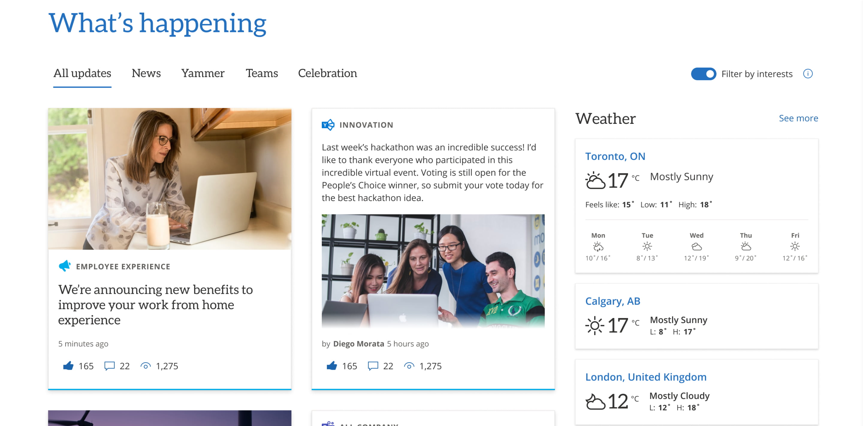
It’s a design pattern that we repeat in news roll-up cards, too, so text is never overlapping an image.
Uncompromising design
While we’ve only highlighted a few examples, we hope this begins to break down the myth that designing for accessibility means compromising on design aesthetics and what we associate as visually pleasing. Using these techniques, among many others, you can create something beautiful, usable and accessible and ultimately, make the experience better for everyone using your website.


