

In this post, we will review some of the situations that can block a mobile strategy and how Habanero can help your organization navigate through them to create a satisfying experience for all users.
Common obstacles to providing mobile support
Effort and cost are the obvious business challenges when creating a more complete user experience. Paired with these is the issue of timing. The idea of mobile support is still gaining traction and may not have been viewed as important when a client’s current site was released. As a result, the site continues to exist without an engaging mobile experience.
The question we had at Habanero was: if an organization is not ready to invest in a ground-up rebuild, what is the best way for them to improve support for their mobile audience?
Our solution: light-responsive
We had begun to hear about these challenges from our clients. They wanted to better engage with mobile users but weren’t able to take on a complete overhaul of their site. Our developers put some thought into what a sound technical solution to this problem would be and outlined an approach we’re calling “light-responsive.” The goal of the light-responsive approach is to significantly improve the mobile user experience while keeping risks low, timelines short, and finance directors happy.
Keeping costs low while providing a great mobile experience
The key to managing costs is to establish boundaries. As mentioned above, light-responsive doesn’t rebuild but rather extends the site. So while it will drastically improve the majority of mobile experiences, not every issue will be addressed.
Light-responsive makes no changes to the platform, HTML, content, information architecture, or authoring experience. It simply adds layers on top of the existing code so the pages work better on small screens. We don’t want to affect the current site because that could significantly increase the risks and quality assurance requirements.
Keep it simple
CSS and Javascript are powerful tools that can easily be scoped to affect only specific screen sizes. With them we can achieve a lot but we must also be careful because we don’t want things getting too complex. Complexity can create more problems than it solves and may make it difficult to maintain alignment between the desktop and mobile views.
Getting started
The two most important issues to tackle when transforming a desktop interface to a mobile one are page layouts and navigation. How will the content be displayed on a small screen? What type of navigation will best support our site structure and users’ needs?
Re-prioritizing content
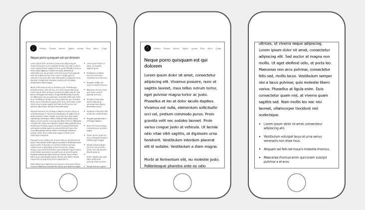
Most sites have at least two columns on any given page. The primary content typically resides in one larger column and a second, less-prominent column is filled with related content, features, or advertising. That is a desktop-centric layout that does not work in the mobile context because the screen is too narrow. If we don’t address column sizes, content will be either too small or contain too many line-breaks to be legible.
The most common solution is to move the secondary content below the main content so everything appears in a single, full-width column. This is easily achieved with small amounts of new code and while it does mean more scrolling, it’s a much better interaction than the broken or illegible one we had before.
Rethinking navigation
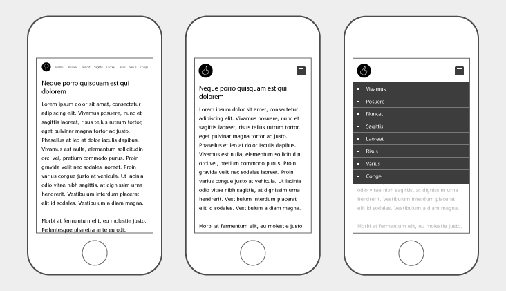
Next is the navigation. The solution here is not as simple. Sites often have a number of different navigational elements that will need to be considered individually.
As a simple example, imagine a typical horizontal navigation bar. This will not fit on a small screen, it is too wide. Yet, if those same links are stacked vertically they become legible and far easier to interact with on a touch screen.
The increased size solves a couple problems but also creates another. Now that that navigation bar is larger, where do we put it? Often mobile navigation is hidden inside a menu button or placed at the bottom of the page, both of which have advantages.
Despite a significant difference in appearance and interaction we can make the above transformations with just a small amount of additional code. Note that this is achieved through additions, not changes. By leaving the existing code intact and having our changes only affect specific screen sizes we limit the need for testing and keep the overall risk of the project low.
Addressing complex components
Navigation and content are two of the bigger hurdles but there will undoubtedly be other elements that need tweaking. Some will be quick fixes but others, such as an image rotator, will require more thought. Image rotators are a common feature in the desktop web experience but can be challenging to adapt to mobile. Many are built to work at specific dimensions and cannot simply be resized with the same ease as text. As a result, we must make a decision about the feature’s necessity in the mobile view. Is it decorative or secondary content or is it integral to the users experience on the page? Can it be removed or must it be re-engineered for the mobile context?
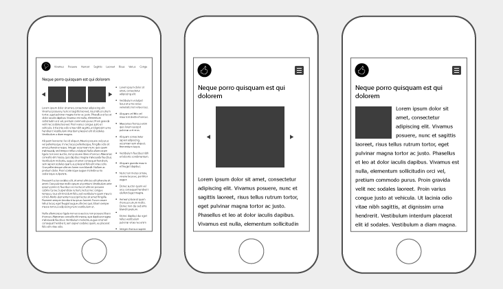
Re-engineering, while a viable option, can be a slippery slope towards complexity. If we want to stay within the boundaries we defined earlier and our goal of a light-responsive solution, careful thought must be put toward why and how we handle each of these components.
Summarizing our approach
There is no hard and fast definition for what the light-responsive approach involves. We have not built a framework or toolset that can be installed or downloaded. Instead, what we have developed is a philosophy. We know each site and client will have goals and boundaries which make sense to them but in every case we want to improve the mobile user experience through judicious, cost-effective additions to the code. These additions mirror but do not impact the existing desktop experience.


