

Microsoft’s SharePoint look book is an awesome reference for the types of sites you can create on an intranet, but it doesn’t offer a lot of inspiration for the pages that typically make up an intranet. To bridge this gap, we’re starting a multi-part insight series to help designers and content authors create common intranet pages in modern SharePoint.
Compared to the classic experience, modern SharePoint gives you much more flexibility to create different and good-looking pages. The modern authoring experience is easier, too, but we’ve found that content authors are struggling to make their pages look good because of the amount of freedom they have. We’re sharing what we’ve learned about designing how-to pages to help you make awesome pages in modern SharePoint.
For each layout, we’ll dig into the different components that make up the page, explain why you would or wouldn’t use them and share our suggestions for how to bring different types of content to life.
Give your how-to page a job
We define jobs for all of our pages. If a page doesn’t have a job, it either needs to get one or get out! A job describes the purpose that your page is fulfilling. It’s the task the user is trying to complete or the experience they want to create. Defining a page’s job is a really important thing to do because it will guide your content decisions.
Based on our intranet projects, we know that how-to pages are a staple in intranets. Their job is to teach a topic and reduce the need for follow-ups.
What might go on a how-to page?
- A descriptive title
- Wayfinding and information architectural elements
- Step-by-step content
- A way for users to get help
- Related documents or resources
The layout of your how-to page can be saved as a template to ensure consistency and ultimately a better user experience across your intranet.
Here are the web parts you might use to create your how-to page in modern SharePoint:
Title area
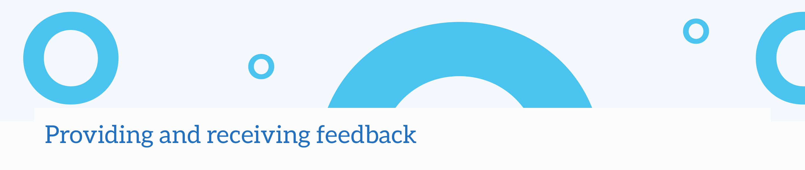
We’ve found success using custom brand banner graphics to help define different page types. They give users a visual cue of where they are in the intranet and tend to be more effective than people photography, which can get cut off in weird places. How-to pages can be quite content heavy, so this is also a nice way to bring a visual to the page.
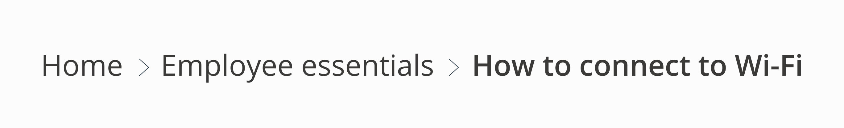
When naming your page, use a task-oriented title to set the expectation that this page includes step-by-step content. For example, try using something like “How to connect to Wi-Fi” instead of “Wi-Fi details.”
Breadcrumb web part
Wayfinding in modern SharePoint can be tricky. One of the ways we’ve tried to improve this experience is by creating a breadcrumb web part, which is available in our intranet product, GO. We like to include this on our pages to help users make sense of where they are in a site. It might seem like a small feature, but it makes a huge impact on the overall experience!
Navigation roll-up web part
Because modern SharePoint has moved away from a hierarchical site structure, it no longer includes wayfinding elements like the local navigation. This was a pain point for users in our projects, so we created a navigation roll-up web part to help alleviate wayfinding confusion. This feature, which is available in GO, allows you to display your hub navigation and help users navigate to other pages within the site.
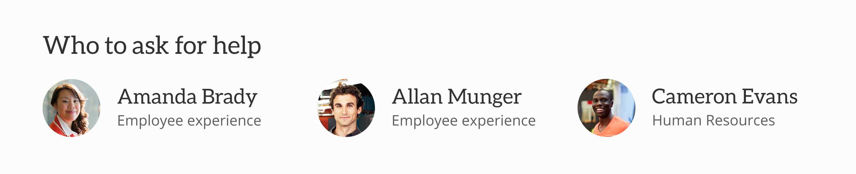
People web part
The people web part links directly to a content author, giving users someone to talk to if they get stuck. Part of why we add this is to support the job of a how-to page: to reduce the need for follow-ups. If your content is owned by a team rather than an individual, you can use text links to link to group emails, such as it@yourcompany.com.
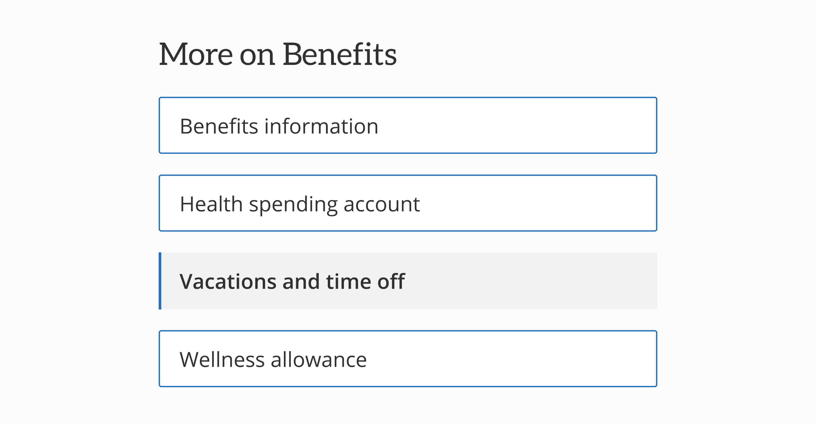
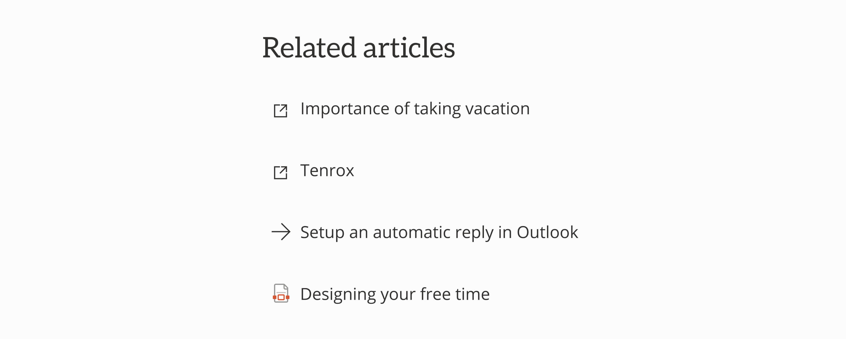
Quick links web part
Provide users with a shortcut to items related to the how-to content. Using fluent icons in a quick link web part is a great way to help users anticipate what will happen when they click on that link.
- A forward arrow to show that you’re going somewhere else in the intranet
- A navigate external inline icon to show that you’re leaving the intranet
- An icon for the type of document you’re going to download
Make sure your content authors are playing by the rules! Use consistent icons so users know what to expect.
Content web parts
Let’s get creative! There are a few ways we suggest leveraging out-of-the-box web parts to make your content look awesome and be more effective for users:
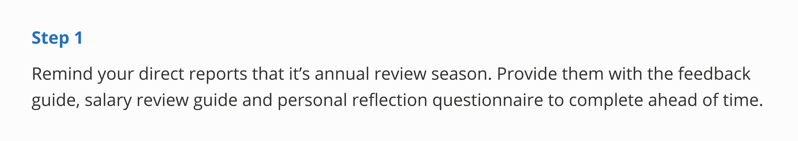
Text web part
Try separating the step number from the step information and playing with text weights and colour. This is a good opportunity to bring in your theme-primary (aka your primary theme colour) to add hierarchy and a little splash of colour.
Divider web part
Dividers are your friend! You can use them to break up sections of your content, such as different sets of steps for different audiences.
Spacer web part
We love white space, and you should too! Adding space between different content helps users know how content is grouped. The great thing about the spacer web part is that you can choose how big you want the space to be. Even something as small as 16px can make a huge difference!
Section backgrounds
Using different section backgrounds combines pieces of content into chunks and makes it easier for users to jump between areas on pages with a lot of content. Use lighter colours to break up content and bolder colours to call attention.
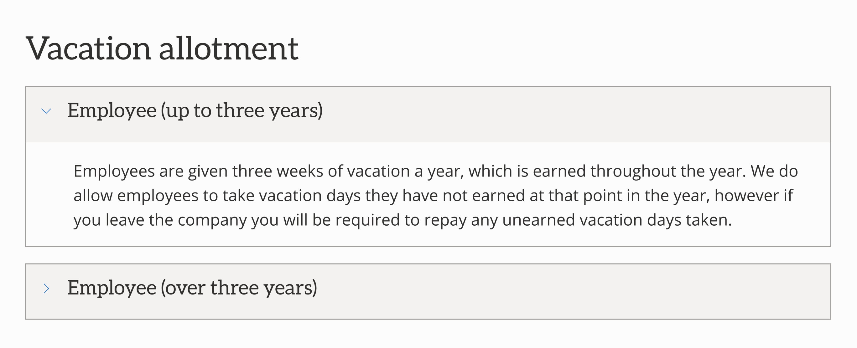
GO FeatureAccordion web part
The accordion web part allows you to group content and shorten the length of a page. Users can scan the topics and click to read more about the information that’s relevant to their task. On a how-to page, you can use accordions to anticipate and answer questions that people might have about your content with an FAQ. Typically, we suggest placing an FAQ at the bottom of a page so that users can first read the content and learn things on their own. Keep the number of accordions to a minimum and remember the job of the page. We don’t want this turning into an exhaustive list!
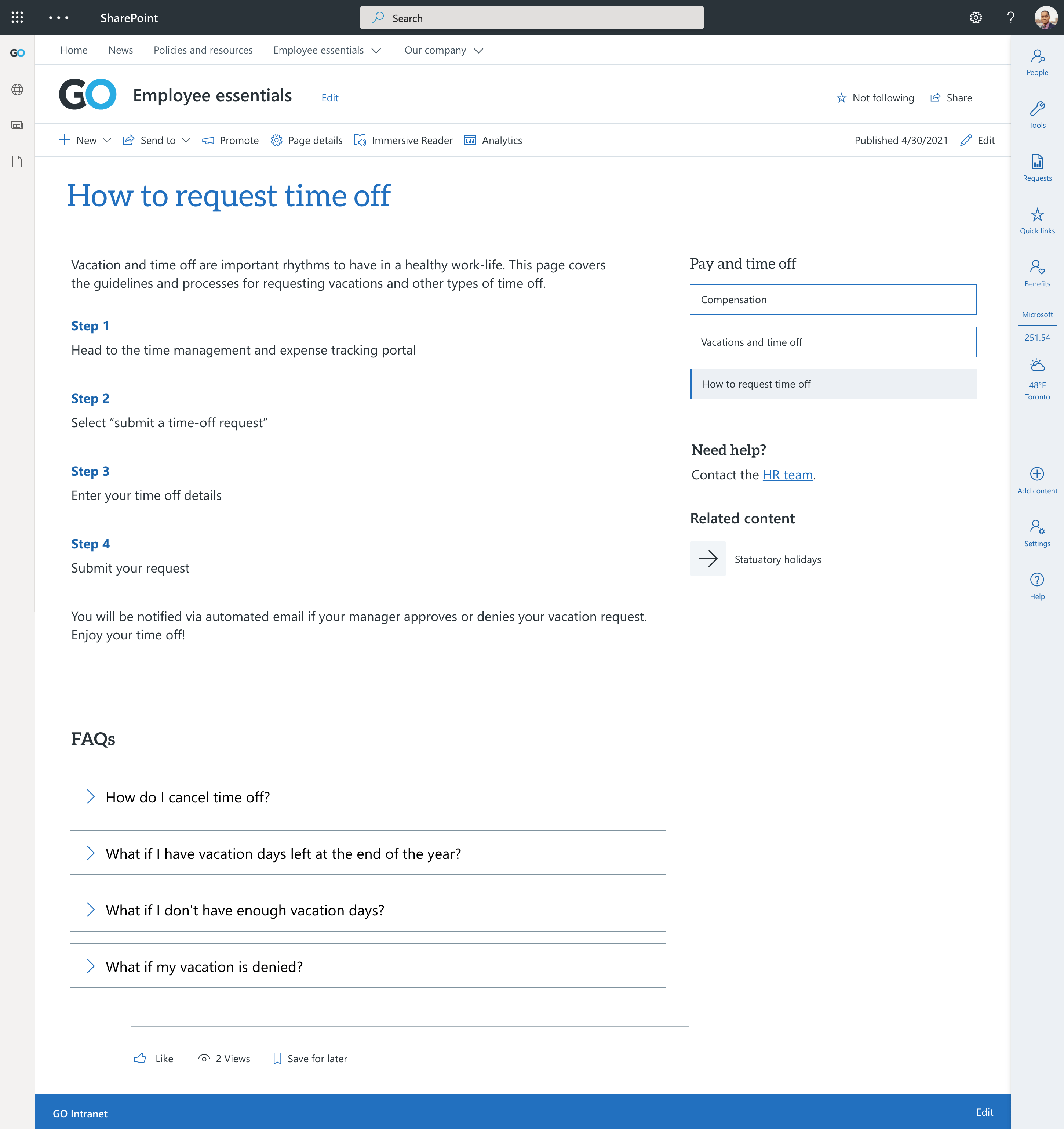
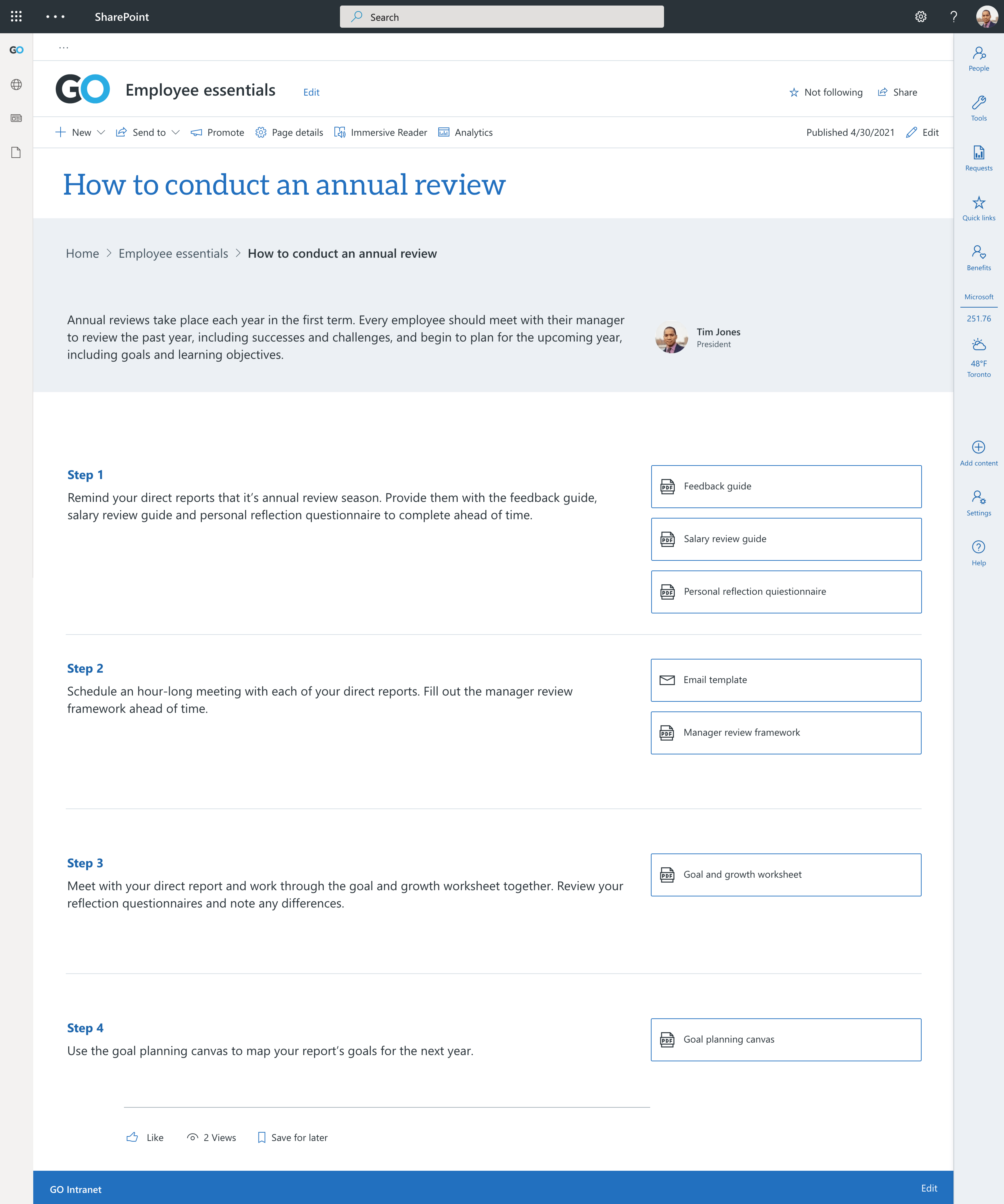
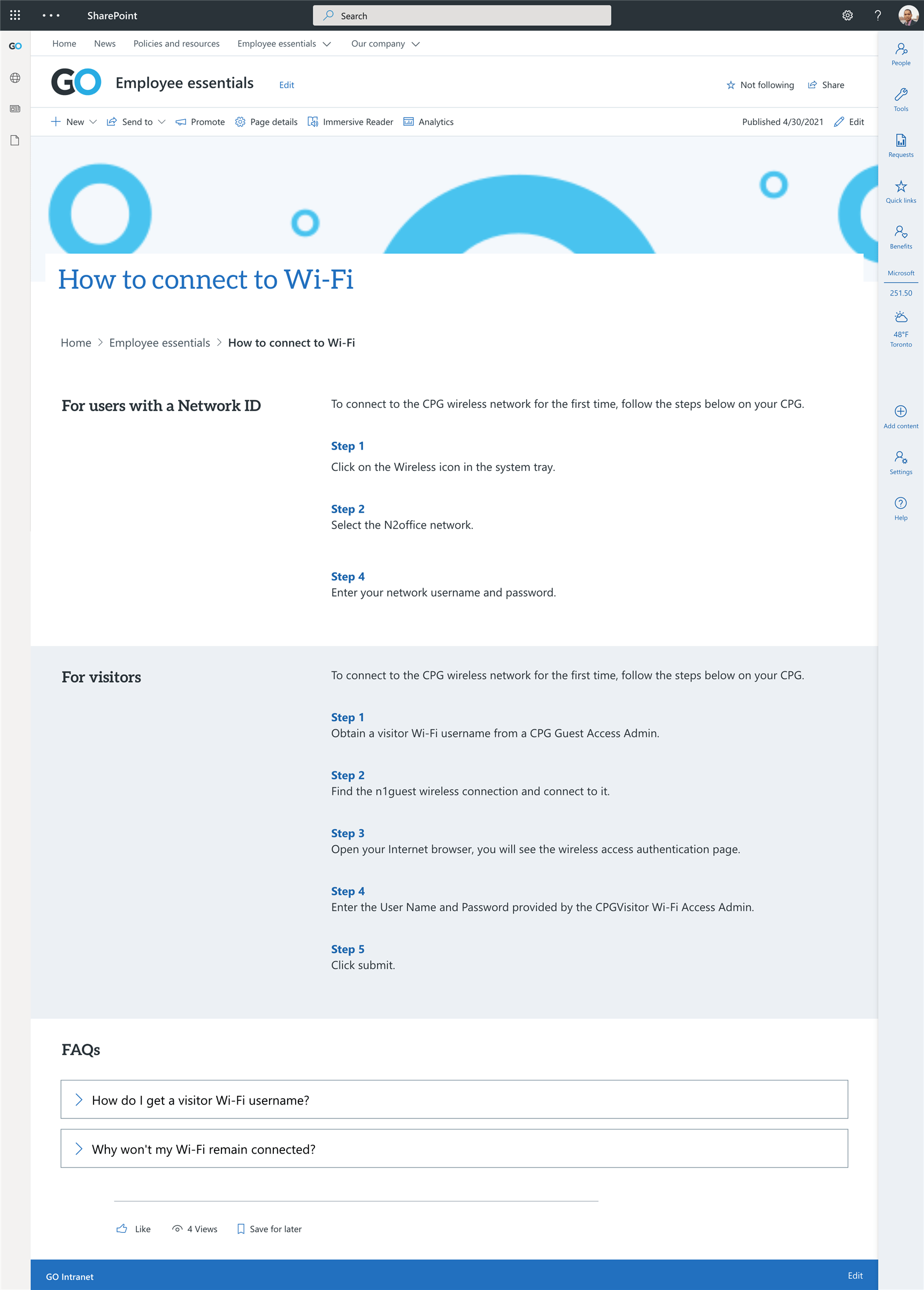
Examples of how-to pages
Here’s how these web parts might work together to create different how-to pages on modern SharePoint:
Takeaways
- Define jobs for your pages to make sure you’re meeting your user’s needs.
- Content is king – let it guide your design.
- Use a combination of out-of-the-box web parts and GO's custom features to create how-to pages that are information-rich without being overwhelming.
- Apply your page layout across all how-to pages to create consistency for your content authors and ensure a more cohesive user experience.
Need help with your intranet’s content? Want to leverage the GO web parts? We can help.


