

Welcome to the second installment in the designing modern SharePoint pages series. Previously we shared our insight into designing how-to pages. Now we’ll look at another intranet staple: landing pages!
Landing pages have become an essential addition to intranets due to SharePoint’s flat site structure. In this post, we’ll share our design tips to help you make awesome landing pages in modern SharePoint. We’ll dig into the different components that make up the page, explain why you would or wouldn’t use them and share our suggestions for how to bring different types of content to life.
Give your landing page a job
It’s a good idea to define jobs for all your pages. What purpose do your landing pages fulfill? Landing pages are a one-stop-shop for everything needed in a specific category, department or domain. They help users drill down into content that might not be featured or accessible in your site’s navigation.
What might go on a landing page?
- A banner image
- A description of what users can anticipate by visiting the page
- Wayfinding and information architectural elements
- Links to the content within a category, department or domain
- Department-specific news or announcements
- FAQs
- Someone to contact for help
You can save the layout of your landing page as a template to ensure consistency. When it comes to landing pages, consistency is particularly important because it helps users identify where they are in your intranet and what they might do on each page.
Here are the web parts you might use to create your landing page in modern SharePoint:
Title area
We’ve found success in using header images on landing pages to help users understand which page type they’re on. Try to stick to a consistent image strategy. You could use photography or a banner graphic.

If your landing page is on a site’s home page, you can add a header by using a full-width column with an image web part. Ensure your images aren’t too tall so that they don’t push your content down too far.
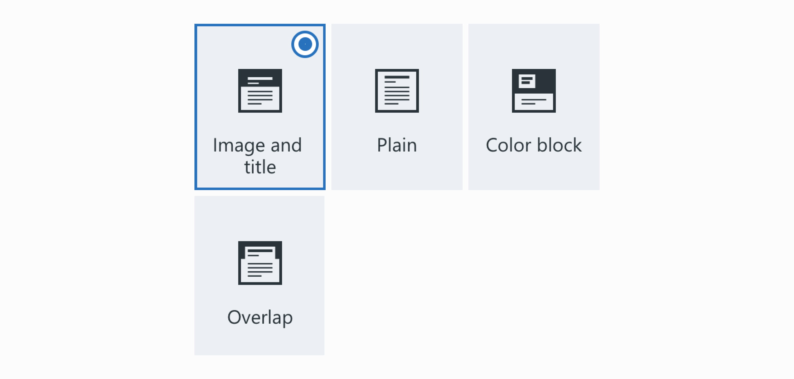
If your landing page is on a content page, you can choose either the image and title layout or the overlap layout to showcase your image.
Breadcrumb web part
Wayfinding in modern SharePoint can be tricky. One of the ways we’ve tried to improve this experience is by creating a breadcrumb web part, which is available in our GO Intranet product. We like to include this on our pages to help users make sense of where they are in a site.

Text web part
The text web part can be used in a few different ways on your landing page:
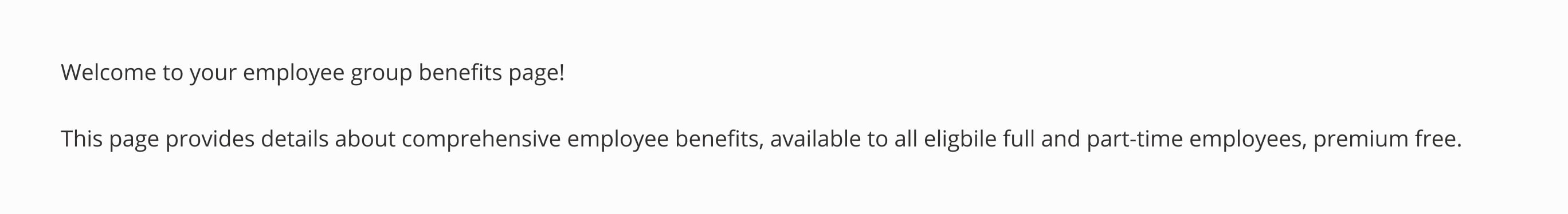
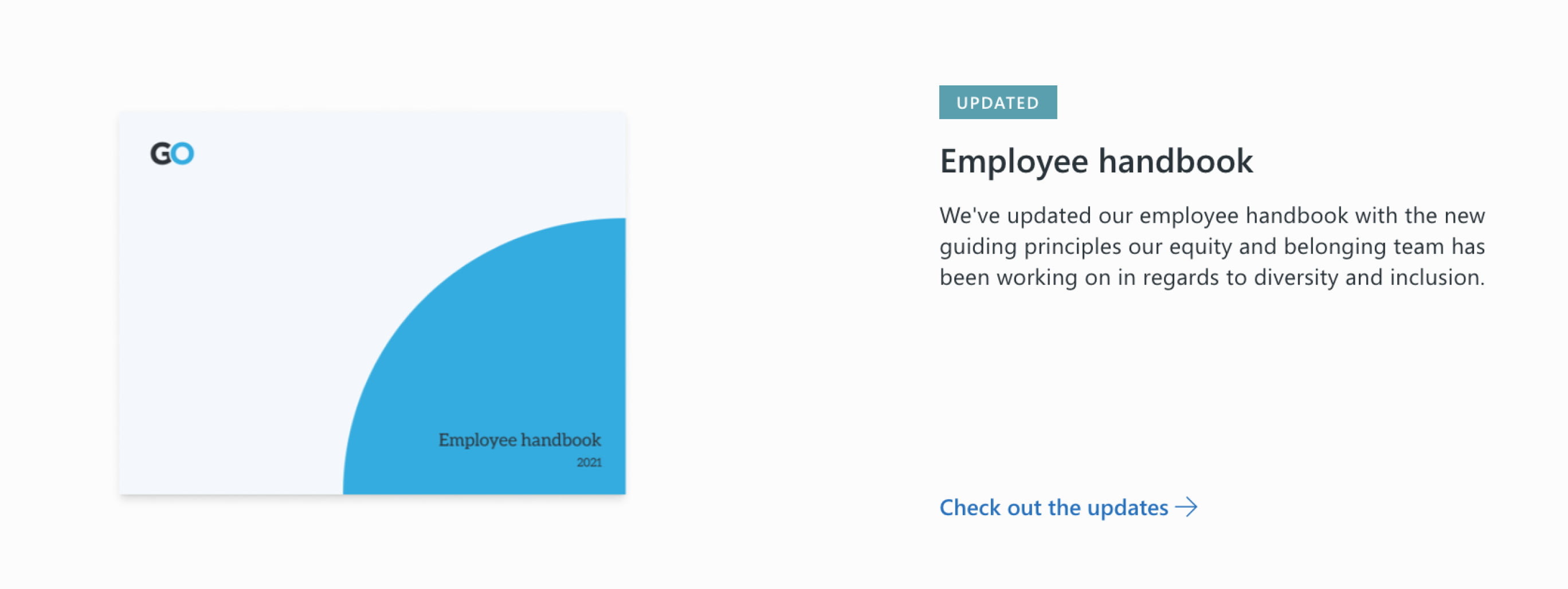
- To provide a description on what this page is about and why a user might be there.
![]()
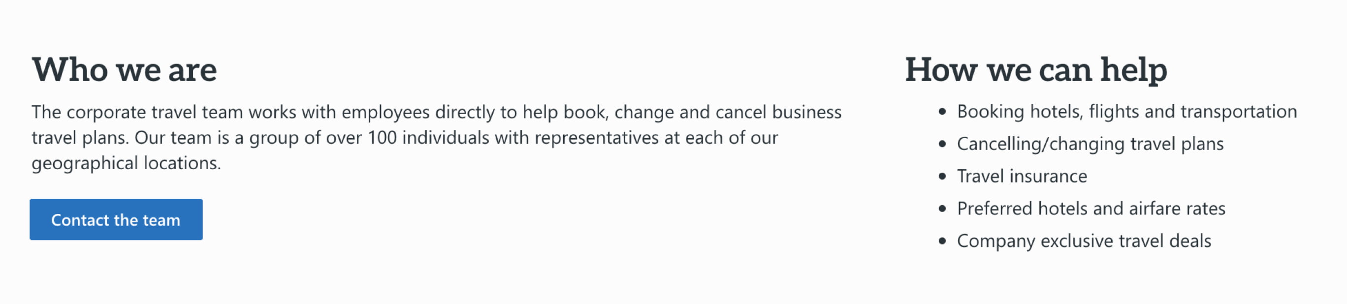
- To provide more context around a category, domain or department that explains who they are, what they do and how they might be able to help.
![]()
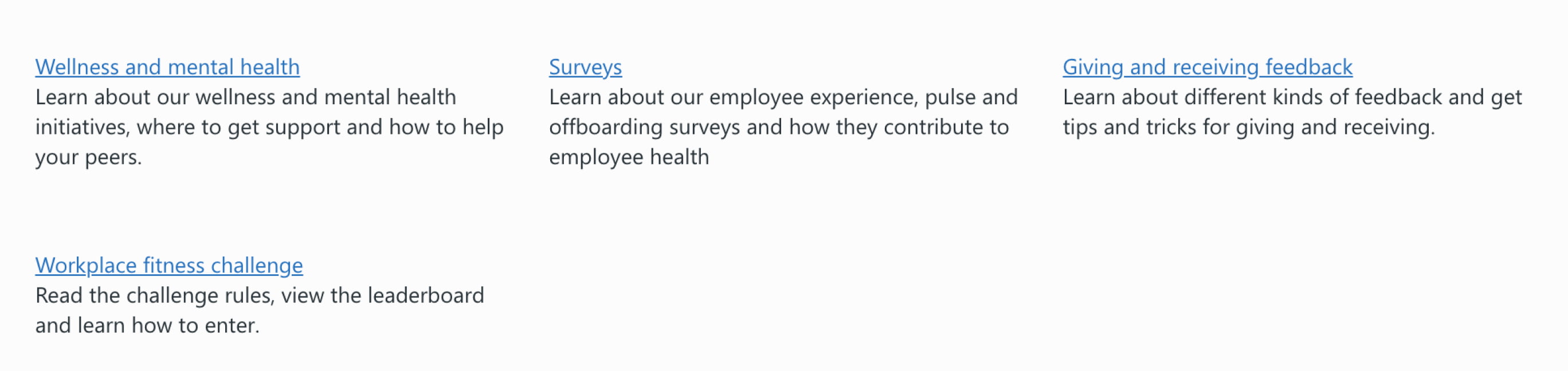
- As navigational links with lengthy descriptions where photography or iconography wouldn’t add value.
![]()
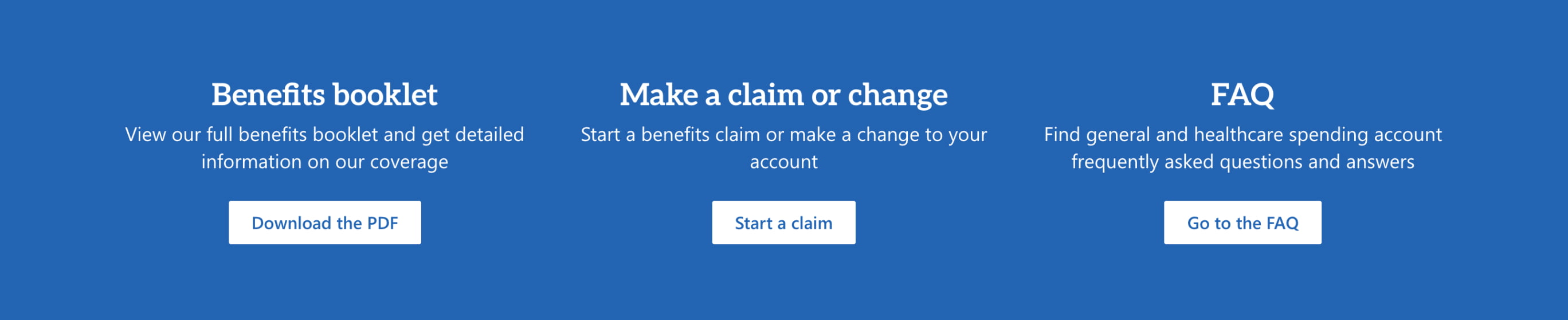
How to use text web parts, button web parts and section backgrounds together
You can give visual priority to the links you anticipate users might be looking for or the ones they use most often by putting them in a strong background section. To help users get where they need to go, use text web parts with titles and descriptions and add a button as a call-to-action.
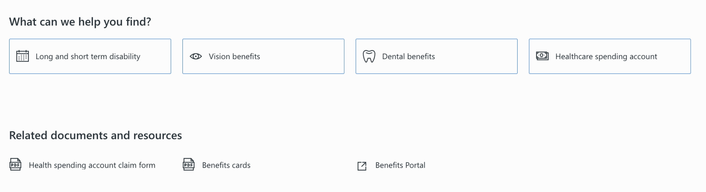
Quick links web part
It’s time to add a navigational element of your landing page! Navigational elements give users links to the content related to your category, domain or department. We suggest you break up your quick links sections based on pages that live on the intranet versus related resources:
- For pages that live on the intranet, use contextual icons (such as an eye for vision benefits).
- For related resources, use icons to indicate document type (PDF, Word, Excel) or location (like an external icon if the link takes the user off the intranet).
We love the versatility of the quick links web part. Explore these layouts, based on your content needs:
- On landing pages, use the button layout with an outline to compartmentalize information.
- For related photos, try the grid layout.
- If you have lower priority links, try less-visual options like the button layout with no outline or the list layout.
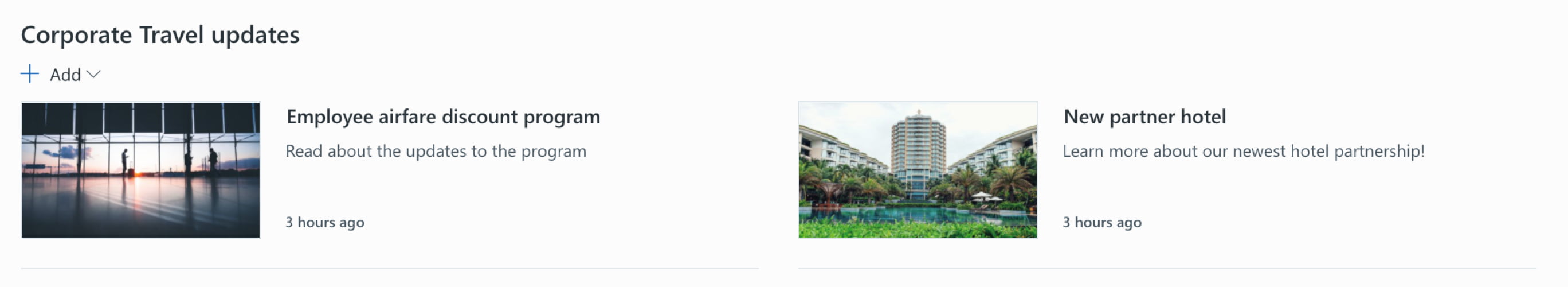
News
If you want to showcase news or announcements that are specific to your category, department or domain, you can add a news web part to this page. To roll up news related to this topic only, you will need your own site on the intranet. For example, if you want to showcase news specific to benefits, you will need a benefits site.
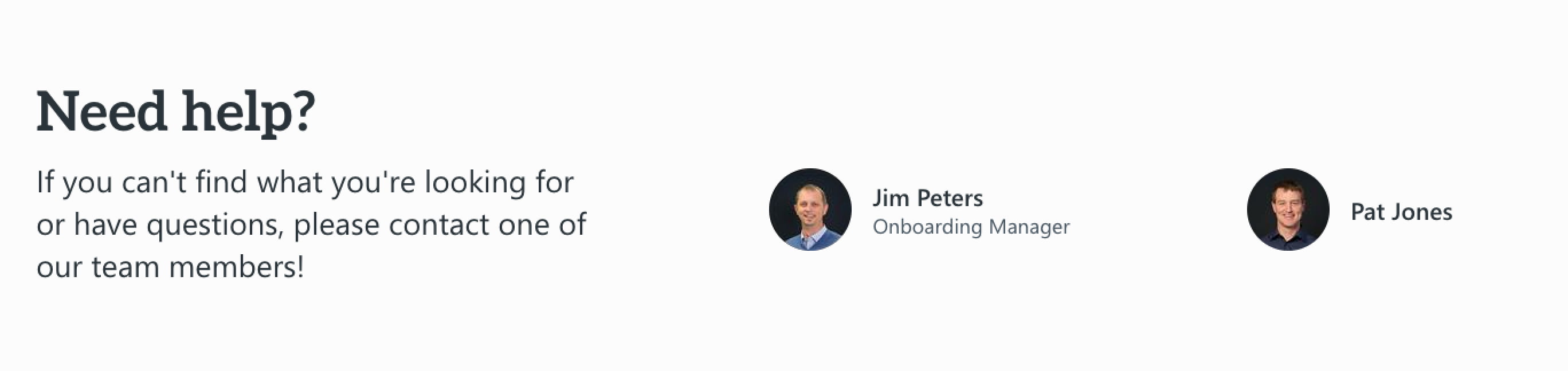
People web part
The people web part links directly to a content author, giving users someone to talk to if they get stuck or can’t find what they’re looking for. If your content is owned by a team rather than an individual, you can use text links to link to group emails, such as it@yourcompany.com.
Hero web part
If your category, department or domain has a featured document or resource, you can highlight it for users with the hero web part. Keep this content fresh. Users will start to ignore it if it gets stale.
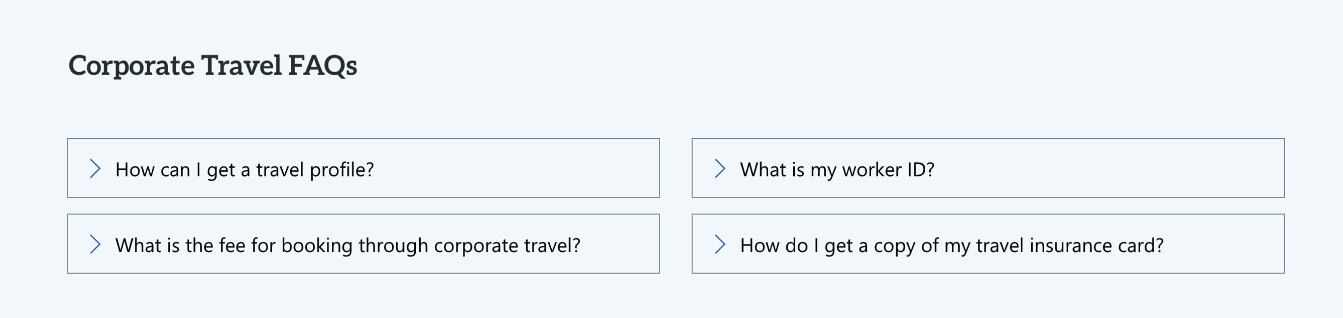
Accordion web part
On a landing page, you can use accordions to anticipate and answer questions that people might have about your content with an FAQ. Typically, we suggest placing FAQs at the bottom of a landing page. We want to avoid pushing key links down the page and allow users first try to find what they’re looking for on their own. Keep the number of accordions to a minimum and remember the job of the page. We don’t want this turning into an exhaustive list!
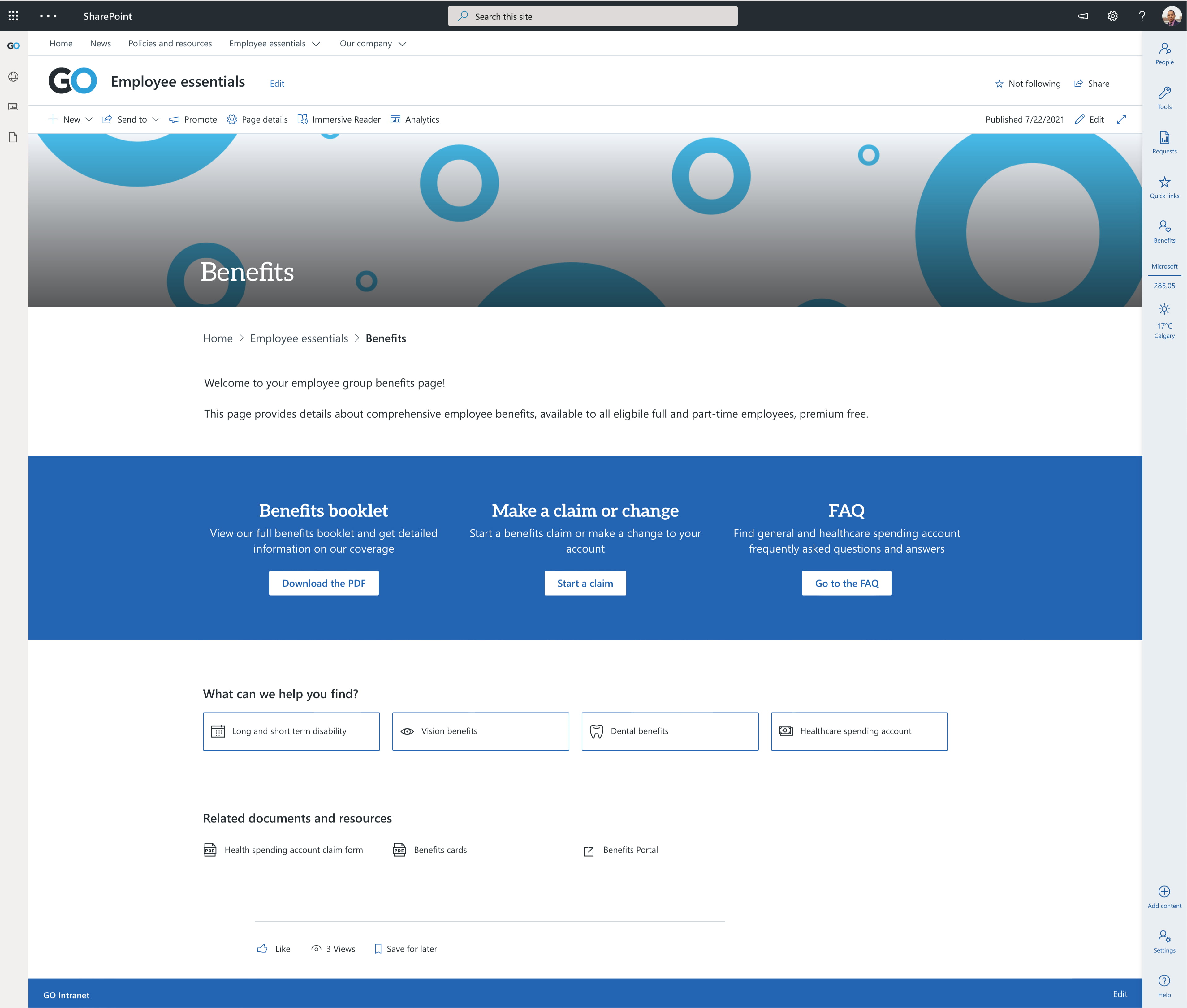
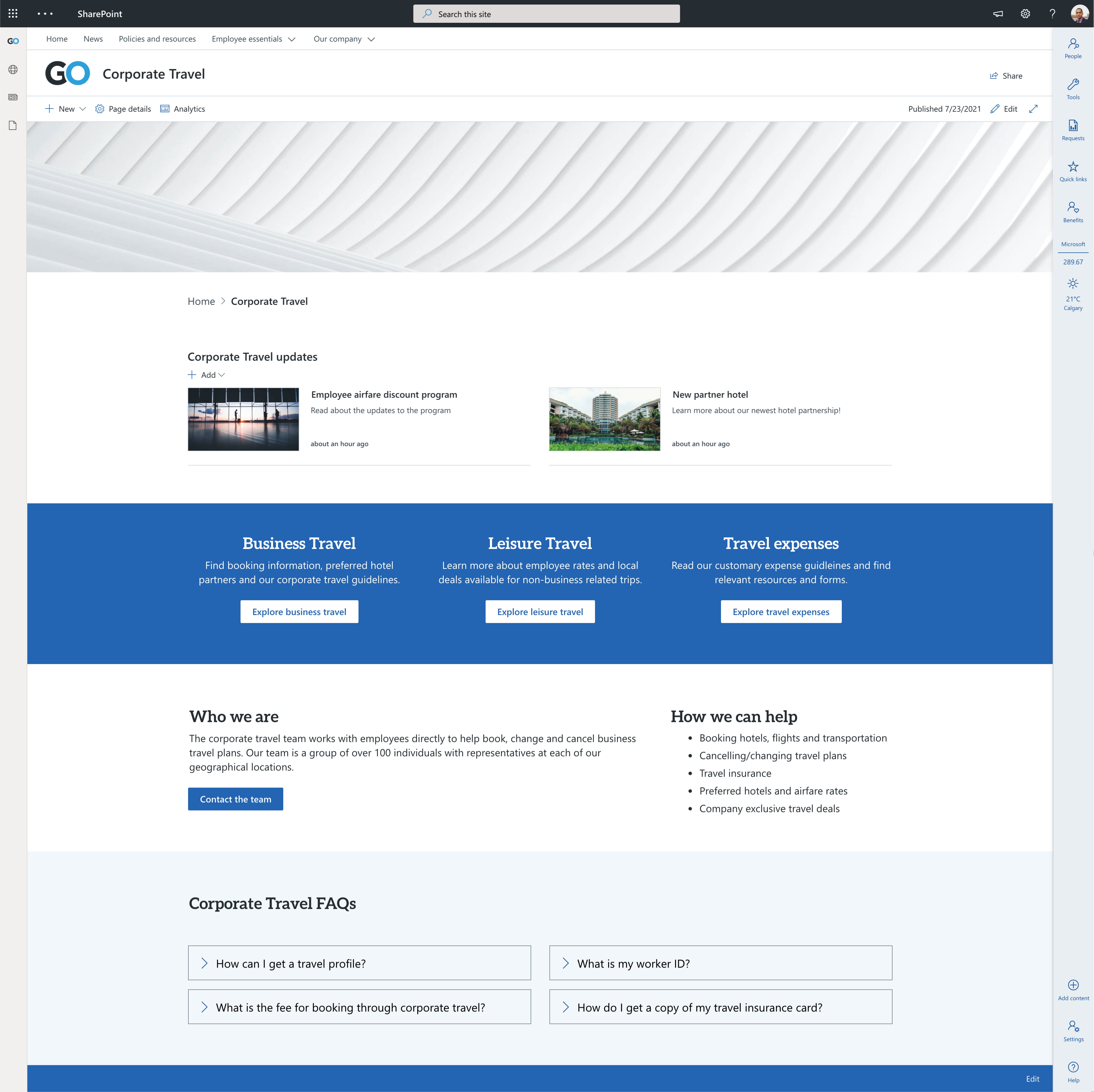
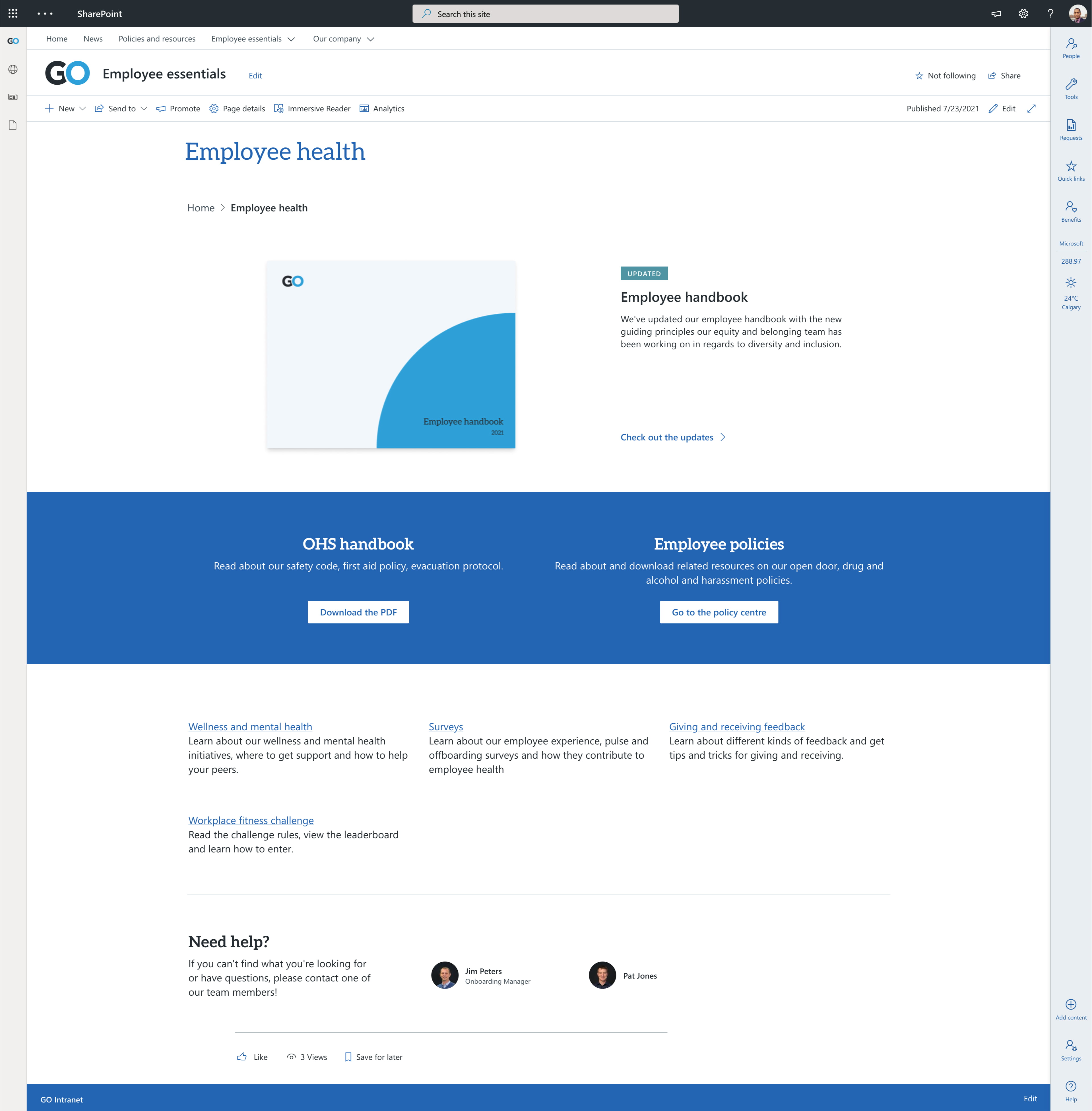
Examples of landing pages
Here’s how these web parts might work together to create different landing pages on modern SharePoint:
Takeaways
- Use header images with intention – identify your image strategy and stick to it.
- Remember the job of your landing page and use it to help you prioritize what content goes on these pages.
- Anticipate why your users are on your page and give them a way to get there quickly. Use this to guide the order of sections and place the frequently visited links at the top.
- Use a combination of out-of-the-box web parts and GO Intranet’s custom features to create landing pages that help users get to where they need to go.
- Use consistent page layouts for all your landing pages to help users understand and learn what they might do on each page.
Need help with your intranet’s content? Want to leverage GO Intranet web parts? We can help.


