

We're working to create better experiences for everyone by taking an accessibility-inspired approach to all facets of our work. As part of our journey to embrace accessibility in design, we're sharing a series of insights that document our process and learning.
In our last post, we shared our tips for dark mode design. In this article, we'll talk about text readability and legibility in typefaces and how they contribute to a more accessible experience.
The number of typefaces available online today is exciting but definitely a bit overwhelming. There are a lot of options to choose from, but not all of them are designed to create a more legible and readable experience. Let's go through some of the most-used typefaces used on the web, and explore how they do (or don't) contribute to a more legible and readable experience.
Why text legibility and readability matter
When designing for online experiences, we need to be more aware of the typefaces we’re choosing and how they might impact the reading experience for our users. However, the terms readability and legibility are often used interchangeably when, really, they mean different things. Let's get into what the differences are.
What is text legibility?
Legibility is a function of typeface design. It's an informal measure of how easy it is to distinguish one letter from another in a particular typeface.
Other common characteristics that lead to a typeface being more legible include:
- They don't draw a lot of attention to themselves and aren't overly "designed"
- Their character strokes are subtle (they aren't overly light or bold)
- They have open counters (the white space within letters such as o, e and c), which prevent blurring of shapes
What is text readability?
Text readability is about the reader and how easily content can be read. There are many different factors that play into text readability, including the typeface used, the letter shapes, sizes and spacing, and even the overall page layout. Poor readability can also change how a reader engages with content – if your content isn't readable, a user likely won't even read it!
Why it's important to consider both
Based on countless studies from the past 15 years, we know that when it comes to consuming content on the web, people scan considerably more than they read (some studies have indicated that people read as little as 20 to 28% of web page content). So you can see why it's essential to look at both legibility and readability.
For legibility, we want to ensure we're giving users the ability to scan efficiently, and when a user does slow down to read content, we want to make sure the typeface is comfortable and easy to read.
Let’s see what this looks like in practice. In this next section, we'll share some examples of obvious readability issues and highlight design characteristics that would improve readability.
finsol.co.nz
Legibility for scanning content
Headings are essential for scanning, so even though it might be tempting to use a more unique, visual striking typeface, we have to prioritize their purpose. An example of choosing style over function is the Finsol website, which uses the Parabole typeface for headings. In particular, characters such as “H” and “X” are almost indistinguishable. The use of all caps further reduces the reader's ability to scan content.
On the positive side, smaller headings and body content use Graphik, which is very easy to read and scan. This is a solid foundation to build on.
Pro tip
Did you know it’s much more difficult to read text in all caps? The outline shape of words in lowercase text are more distinctive than the outline in uppercase letters, which are uniform and rectangular in shape. This is why it’s faster to read text in lowercase letters vs. uppercase!

Image source: Google Fonts.
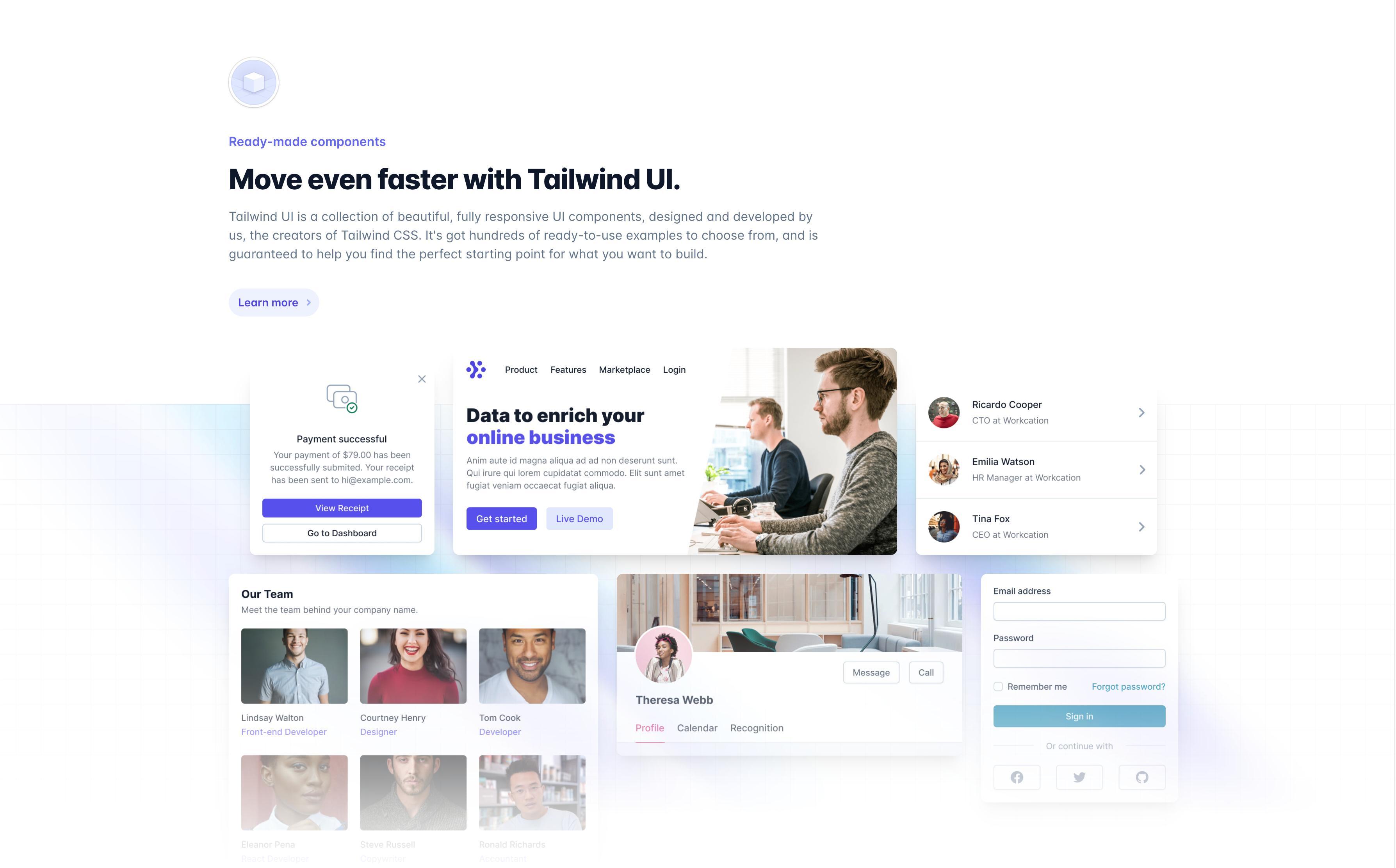
tailwindcss.com
Some companies, like Tailwind CSS, use more simple typefaces for their brand. In this case, they’re using Inter, a highly legible and readable typeface. Not only does it have nine different weights, but it was also specifically designed for computer screens. This is the perfect example of a typeface that suits the purpose of its application – Tailwind is a UI framework, so Inter needs to work well at multiple sizes and in different components.
Although Inter is a highly legible and readable typeface, its one downfall is that it lacks personality. To get around this, it’s accompanied by vibrant colours, gradients and interesting UI elements. They’ve also used multiple different font weights, which makes the overall design look more compelling.
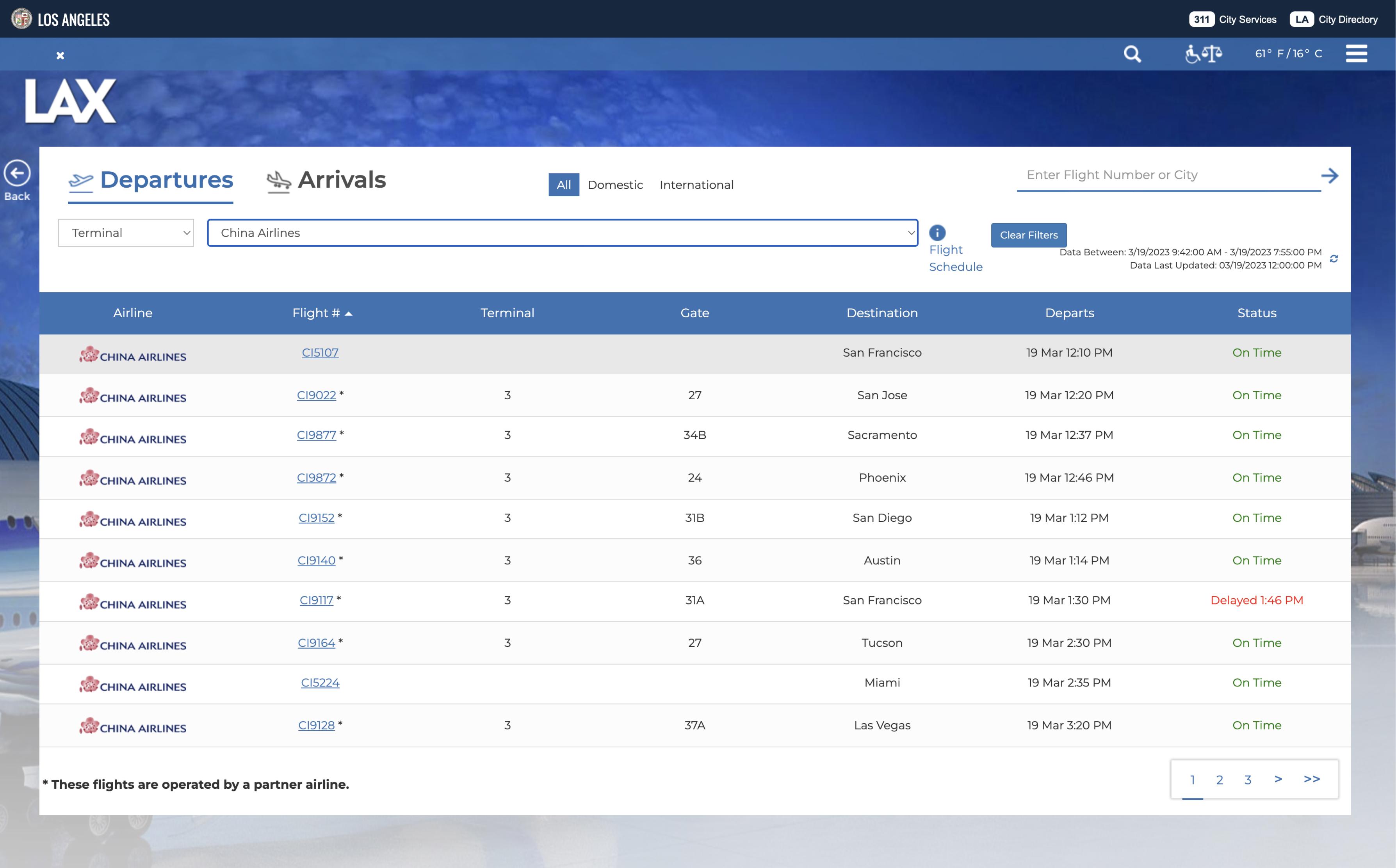
flylax.com
When letters and numbers look the same
We don’t often see a mix of characters and numbers together, but there are instances where this happens, such as flight numbers on airport, airline and travel websites. In these cases, it's critical that the typeface letters and numbers are easily distinguishable from one another.
The LAX website uses Montserrat typeface, and there are a few cases where characters and numbers can be mistaken for one another. It’s hard to tell the difference between the number “1” and letter “I” or the number “5” and letter “S.”
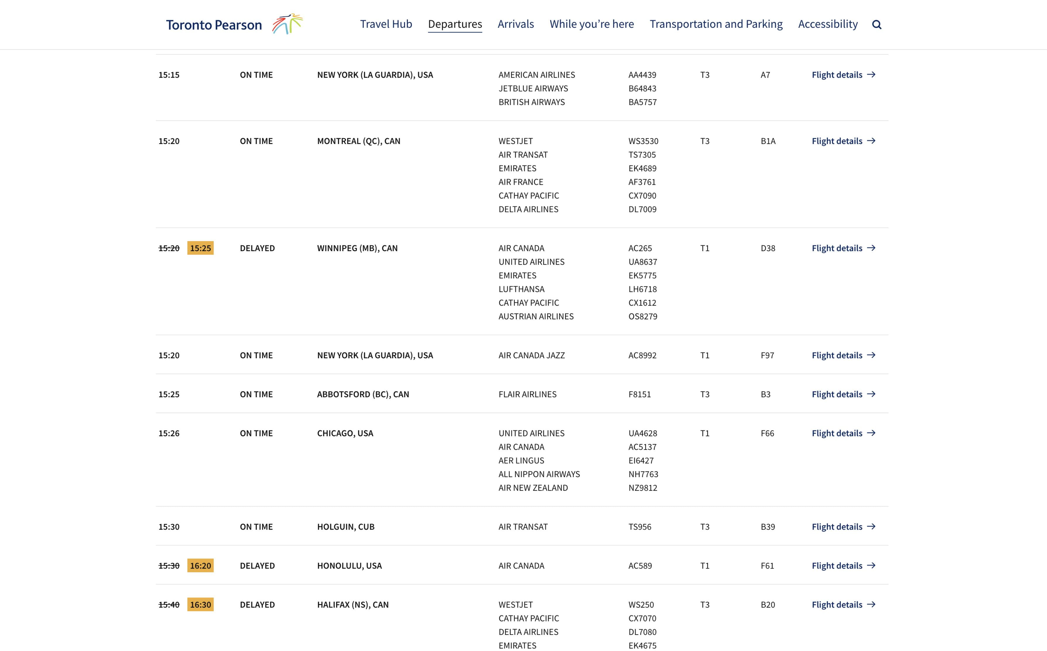
torontopearson.com/en/departures
For the Toronto Pearson website redesign, accessibility was top of mind. For that reason, we picked the typeface Source Sans Pro, as it was created for legibility in UI. You can see this when comparing letters such as “I” and number “1” – they're easier to distinguish because the “1” has a stem in addition to an ascender at the top. Source Sans Pro also has an open and friendly simplicity to it, which is something you may not always get with a highly readable and legible font.
ikea.com/ca/en/home-design
Creating inclusion through type choice
When a character can’t be displayed in a font, it's replaced with a little rectangular box. Fun fact: this symbol has come to be known as “tofu,” because it looks like a block of tofu! While it has a cute name, it’s not great if you’ve ever experienced seeing one of these while reading something on the web. It means that the typeface doesn’t support multiple languages and, therefore, is not accessible, readable or legible for users all over the world.
Inclusivity through type was a big enough issue for IKEA that in 2020, they switched to Noto Sans, because their former typeface didn’t support Asian characters. Noto, which is short for “no tofu,” is one of the most expansive typographic families ever made. It supports 800 languages and 100 scripts in up to 8 different weights and, as the name suggests, no tofu.
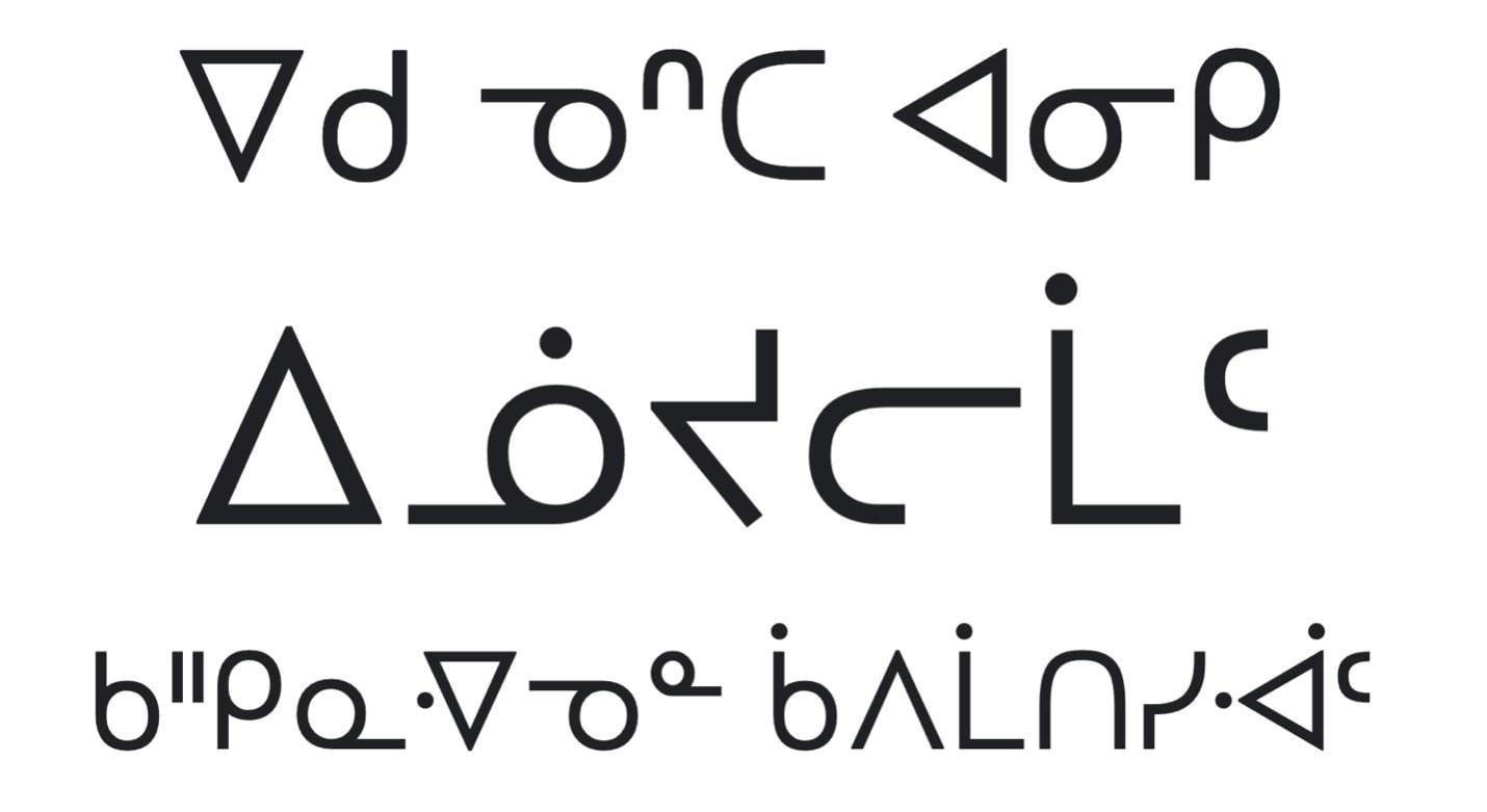
Noto Sans Canadian Aboriginal type specimen from Google Fonts.
One of the most unique things about Noto is that it includes a font collection (which they call Noto Sans Canadian Aboriginal) to support Indigenous languages in Canada that use the syllabics writing system. This enables Indigenous language speakers to digitize and preserve their languages on the internet and in print. To cover all the languages in BC, the provincial government merged Noto Sans and Noto Sans Canadian Aboriginal into a single font, BC Sans font, so their communication would be accessible to all 5 million residents.
Choosing your digital typeface
With so many typefaces to choose from, we know from personal experience that it can take hours to pick just one! Here are our tips for narrowing down your options:
- Consider your budget. Open-source fonts are licensed so that anyone can use them anywhere, for any purpose, free of charge. If you're looking for a typeface on a budget, Google Fonts is a great way to go. If typography is important to your brand communications, you might want to buy a typeface by visiting websites like MyFonts.
- Ensure your typeface is robust and comprehensive enough for your project. Not all typefaces are designed equally. If things like multi-language support and variety in weights and styles are important to you, make sure your typeface supports those options.
- Determine your project’s overall feel. Are you looking for something fun or serious, simple or intricate, formal or informal? Consider the vibe you're trying to go for and choose a typeface to match. For example, you wouldn't use Comic Sans to write a business report! Remember: good design goes unnoticed, bad design does not.
- Make sure your typeface works at multiple sizes. If your choice of typeface makes it impossible for your reader to understand your content, then your design has failed. Readability and legibility can be impacted by the size of your font – one that looks great at a larger size may not work at smaller sizes. Consider how you'll be using your typeface and test it out!
Uncompromising design
We hope these examples break down the myth that designing for accessibility means compromising on aesthetics. Using this knowledge, you can use typefaces that contribute to immersive storytelling while still caring about accessibility.
Want to learn more?
If you’re interested in reading more about this topic, here are some other articles that we enjoyed reading:
- Choosing Fonts for Your Data Visualization by Tiffany France
- How Typography Can Save Your Life by Lena V. Groeger
- The U.S. Government's Public Sans Is a Typeface Fit for Civic Duty by Liz Stins
- Down the Font Legibility Rabbit Hole by Peter Vermaercke
- How people read online by Kate Moran
- How type influences readability by Hilary Palmen


