

Welcome to the third installment in the designing modern SharePoint pages series. Previously we shared our design tips on how-to pages and landing pages. Now we’ll look at the pages that will make up the bulk of your intranet: content pages!
Content pages are an intranet staple. They’re the information pages on your intranet that help employees understand a subject or do a job. Content pages usually house lots of information, so we’ll share our design tips on how to make them awesome instead of overwhelming!
SharePoint and GO have many web parts that can be awesome for content pages, depending on your needs. To figure out which web parts to use, consider the job of your page and the types of content you want to display. In this article, we’ll highlight some of our favourite and most frequently used options.
Give your content page a job
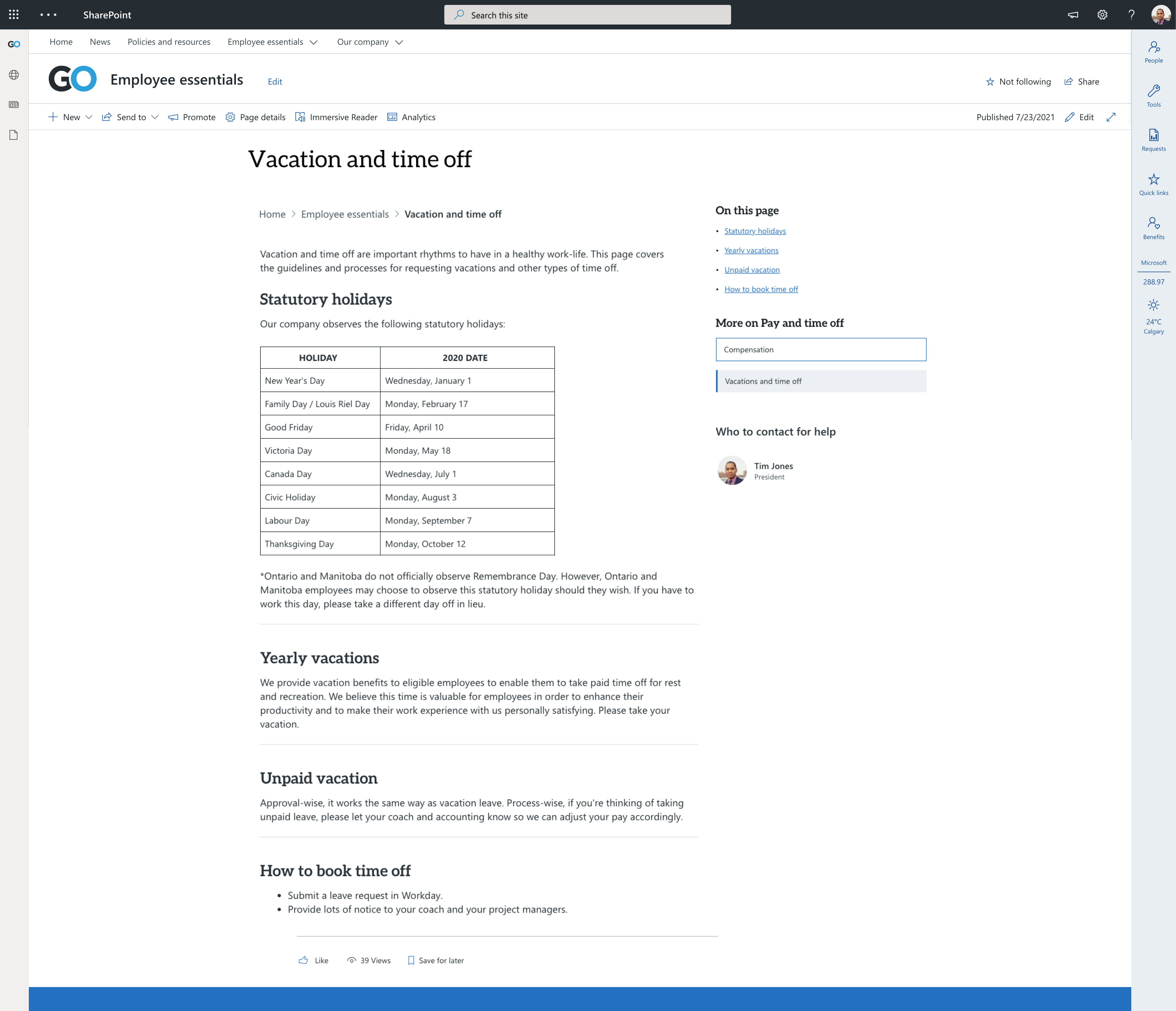
We recommend defining jobs for all your page templates. For example, a content page on your intranet might be titled “Vacation and time off.” Its job is to explain your organization’s vacation policy and describe how to book days off.
What might we put on a content page?
- Wayfinding and information architectural elements
- The meat and potatoes of our content, which could include:
- Text
- Related documents
- Videos, photos or other media
- FAQs
- Supplementary information on the content, such as:
- Who to contact for help
- Links to related content employees might be looking for
Your content page layout can be saved as a template on your site to make authors’ lives easier and help with consistency. Not all content pages will look the same, but the overall layout of each one should be consistent with its sibling content pages. This helps employees understand what type of page they’re on within the intranet and how to navigate between them, which is especially important with modern SharePoint’s flat site structure.
Here are the web parts you might use to create content pages in modern SharePoint:
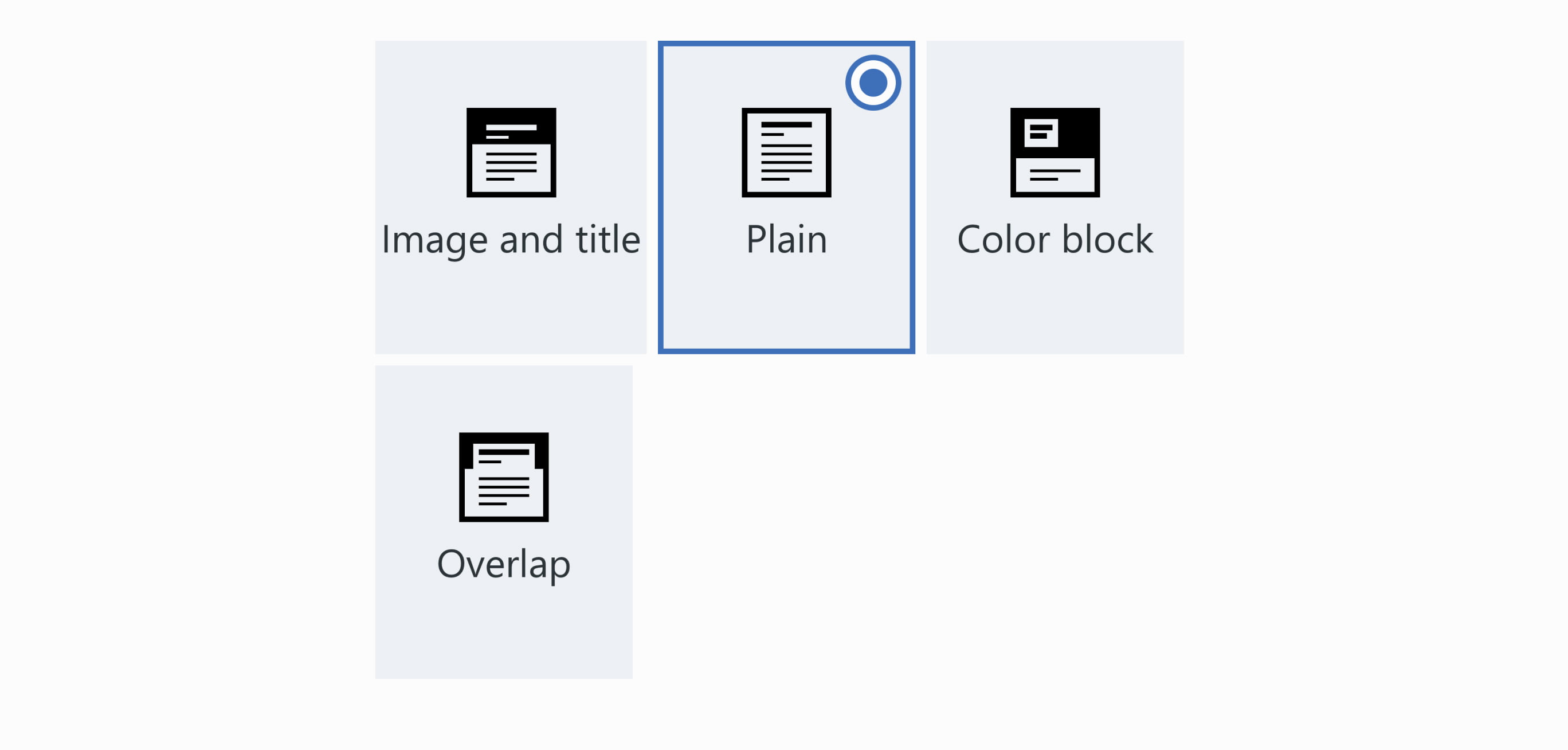
Title area
When it comes to content pages, we typically find that “plain” title areas perform the best for a couple of reasons:
- It can be difficult for content authors to find a suitable photo that is both relevant to their content and works well in the long and skinny title space.
- Simple content pages can help the employee understand that we’re drilling deeper into the intranet.
- Employees have come here to do a job or learn something, so we don’t need to distract them with different images.
Breadcrumb web part
Wayfinding in modern SharePoint can be tricky. One of the ways we’ve tried to improve this experience is by creating a breadcrumb web part, which is available in our GO Intranet. We like to include this on our pages to help employees make sense of where they are in a site. On content pages, the breadcrumb web part helps employees navigate back to their landing page.

Navigation rollup web part
GO’s navigation rollup allows sections of your hub navigation to be automatically displayed on your page. This allows employees to navigate between pages under a topic (like all things benefits), simulating a local navigation that modern SharePoint is missing.
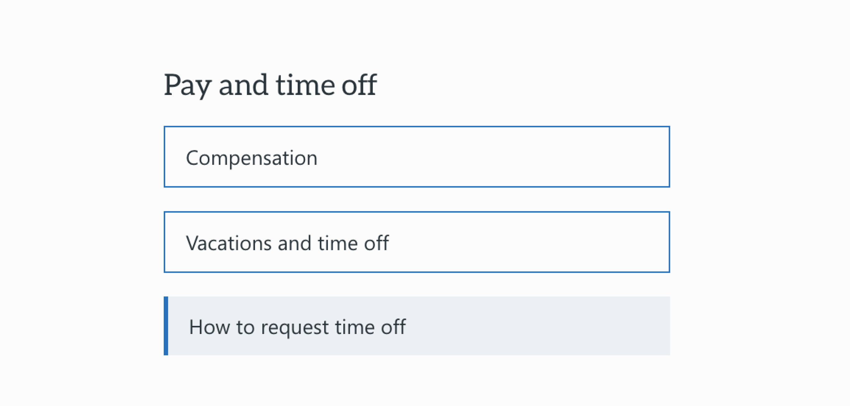
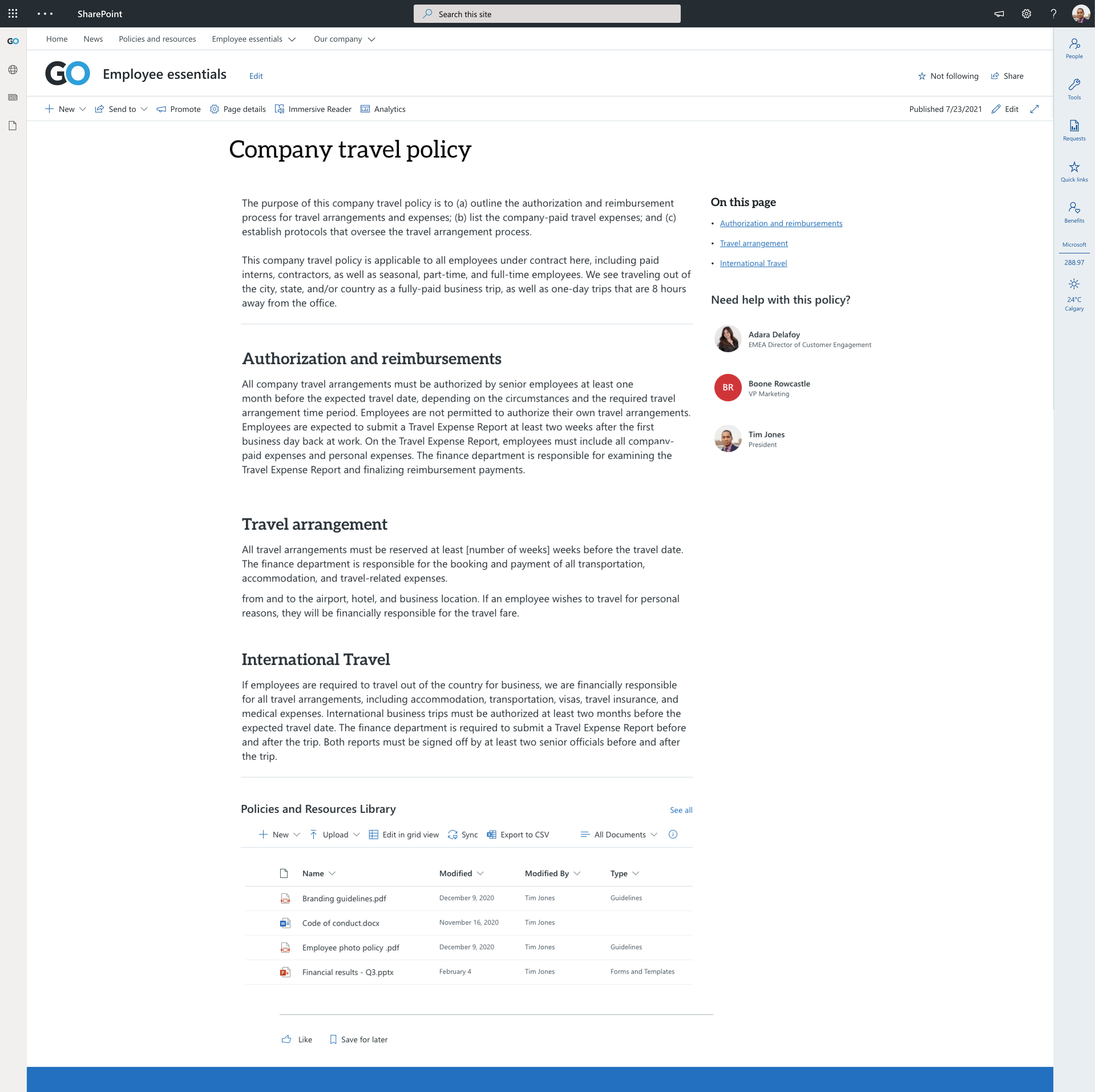
Table of contents web part
Content pages can get lengthy! GO’s table of contents web part makes it easy for employees to find what they’re looking for by automatically pulling all H1s from your page and making them clickable links. We recommend breaking up your sections with task-based titles and placing the navigation rollup near the top of your page. This will help employees zoom directly to what they are looking for.

Text web part
This will likely be the most used web part on your content page. These pages are all about, well, the content! Try your best to keep the content concise and stick to one topic per content page. We want to try our best to keep these pages from becoming super long!
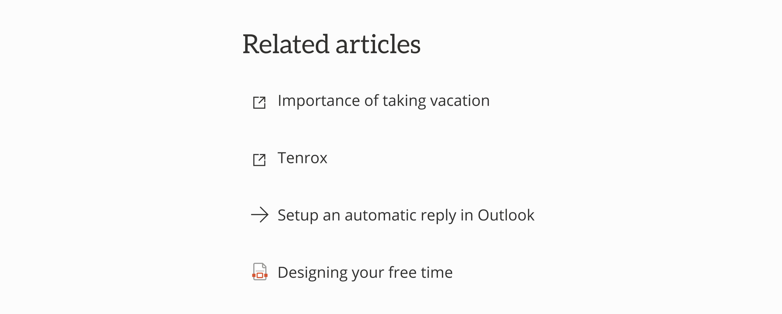
Quick links web part
Quick links can come in handy in a couple different places on your content pages:
- Within the content – links employees to documentation, forms or pages on the intranet related to the task or information at hand
- In a sidebar – suggests supplementary or related information that an employee might want to check out
We like to use icons to help employees anticipate what they’re going to get from clicking these links:
- For pages that live on the intranet, use a forward arrow (to communicate you’re moving to another page on the site)
- For related resources, use icons to indicate document type (PDF, Word, Excel) or location (like an external icon if the link takes the employee off the intranet).
List web part
If you have a long list of related resources or documents, you can use the list web part to surface important information. The list web part can be beneficial with longer lists because it allows employees to filter and sort to find what they need.
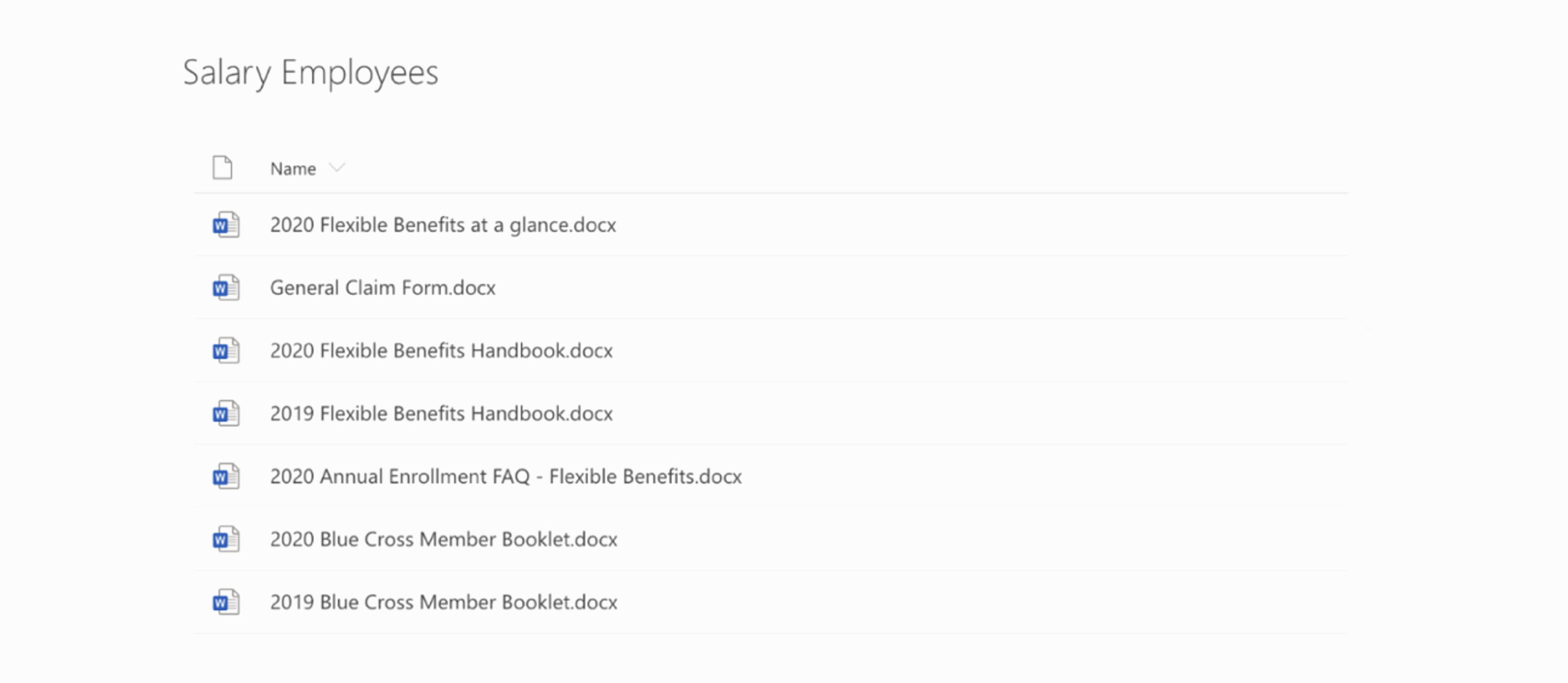
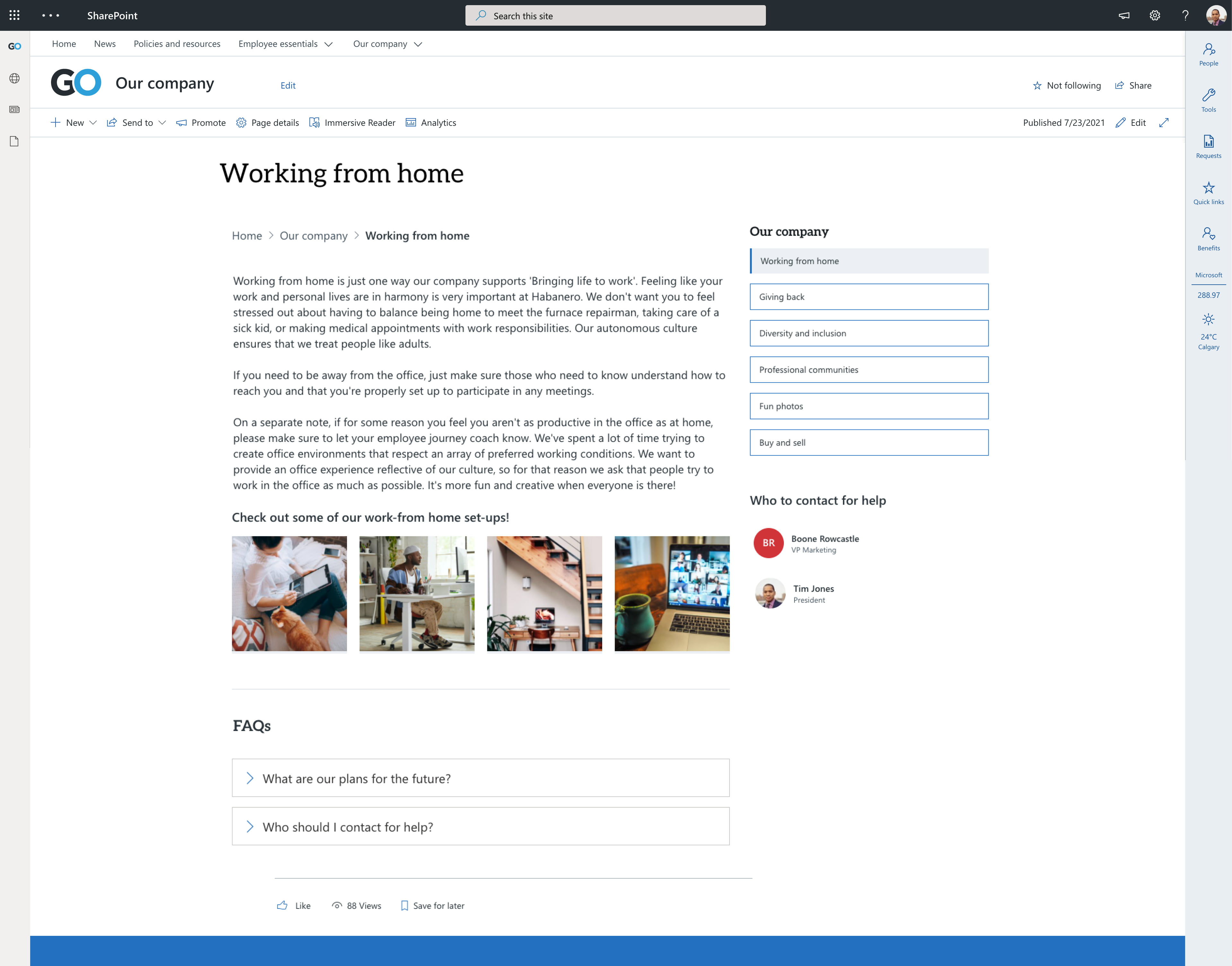
Photo or video web part
You can surface supplementary photos or videos with the out-of-the-box SharePoint web parts.
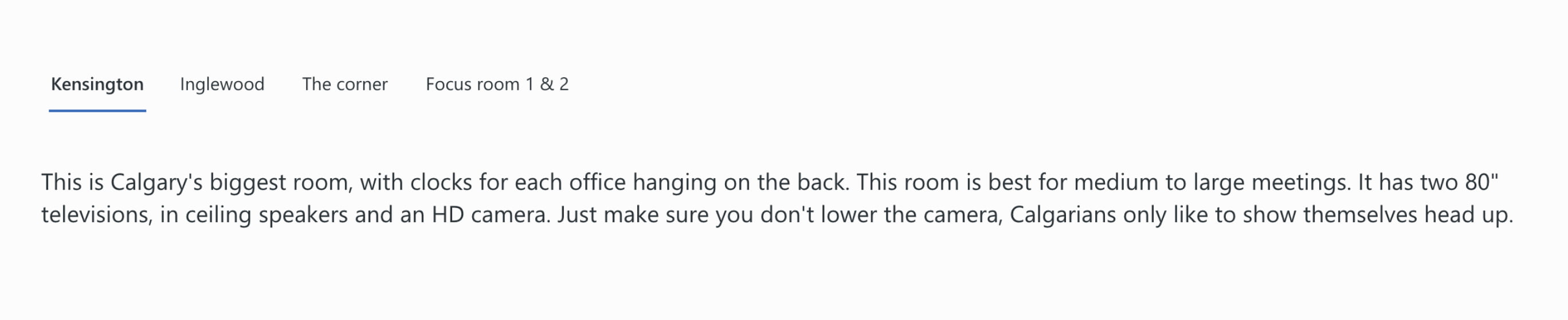
Tab web part
Sometimes you want to deliver targeted content to different groups based on criteria like geographical region or tenure. If the information isn’t sensitive (meaning it’s okay for people outside the group to read it), you can break the content up using tabs. This allows employees to select the content that is most relevant to them.
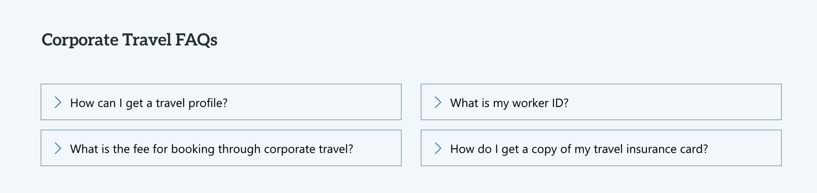
Accordion web part
You can use accordions to anticipate and answer questions that people might have related to the topic of your content page. Employees can scan the list of questions and click to expand the one that is relevant to them to read the answer.
Keep any essential information or tasks related to your content page in the main body of the page, so your employees don’t have to go hunting for them in the FAQs. We recommend displaying FAQs near the bottom of the page and keeping the number of accordions to a minimum. Remember the job of the page – we don’t want this turning into an exhaustive list!
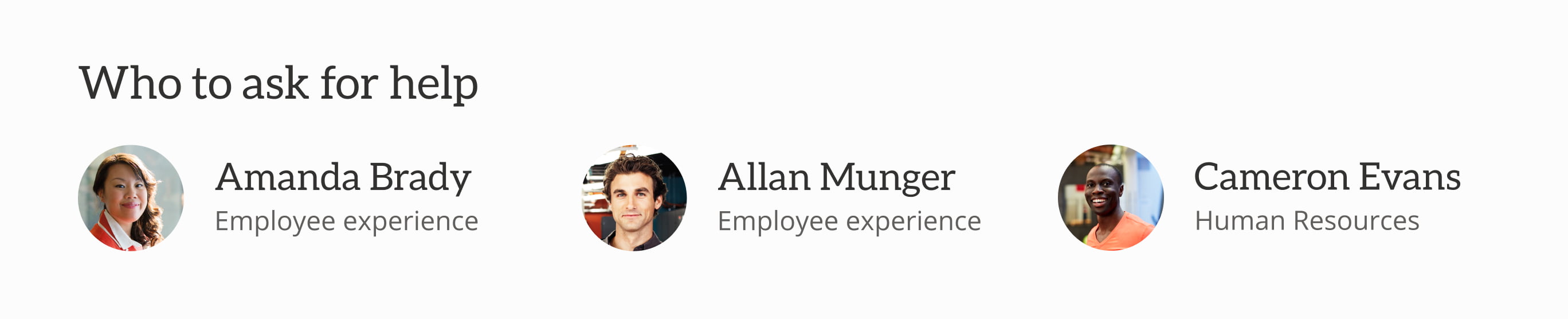
People web part
The people web part links directly to a content author, giving employees someone to talk to if they get stuck or can’t find what they’re looking for. If your content is owned by a team rather than an individual, you can use text links or buttons to link to group emails, such as it@yourcompany.com.
Spacers and dividers
Because content pages can get dense, it’s important to break them up! Using spacers and dividers will help employees be able to “chunk” information in their brains and will also help it feel less overwhelming.
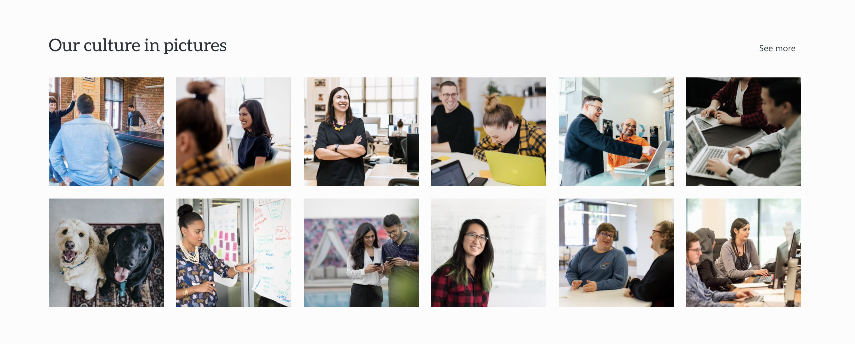
Examples of content pages
Here’s how these web parts might work together to create different landing pages on modern SharePoint:
Takeaways
- Identify the job of your content page to help you choose the appropriate web parts to meet your objective.
- Keep the layout of your content pages consistent to help employees understand where they are and how to navigate.
- Use web parts, like tables of contents, FAQs, tabs, lists and spacers, to break up pages and make content more digestible.
Need help with your intranet’s content? Want to leverage GO Intranet web parts? We can help.


